Don't Be Afraid to Break the Layout in Web Design: Go Beyond Borders
Series: Exclusive Web Design—Part 2
It's by no means that we should break the rules as some people like to say that rules are made to be broken. Humans are social animals—or should we say political animals—, they tend to want to be part of a group that shares similar values. Where they meet, interact, and connect with people who can fill each other's gaps, thereby helping them achieve certain values in life.
At the same time, people also want to be easily recognized among the crowd, to be able to express themselves, and live their own lives carrying an identity as an individual. As long as it doesn't exclude them from the groups they like to be in, they'll continue to search for something by which can reflects their behavior, style, and personal narratives more accurately.
Today we no longer group people only by demographics, but rather classify them by the values they hold. This has blurred the lines of uniqueness and exclusivity more than ever, leading us to conclude that humans aren't completely unique, in the sense that there isn't any single attribute inherent in them that no one else has. Some attributes will place them in one group, while others will fall into another.
It doesn't matter anymore whether we're unique or not. Rules in certain condition are no longer relevant. What is more important is to show others the values we uphold; values that can relate to a group of people. By introducing to some web designs that might inspire you, this series of articles aims to help you become more accurate in expressing your brand according to its target consumers.
In this article:
- Hero Section
- Grid Layout
- Card List
- Call-to-Action
- Carousel
- Paragraph Breakout
- Article Breakout
- Drop Cap
First time visiting? Read the first article in this series: Non-Rectangular Images in Web Design: Think Beyond Commonalities.
Hero Section
This is the first part of the page which all visitors see when they visit the website. The very best place to engage them to scroll down or explore the website further. The place where we might want to do some experimentation to be more creative than most websites that still use the "default" hero section design from Bootstrap—which is honestly already really good.
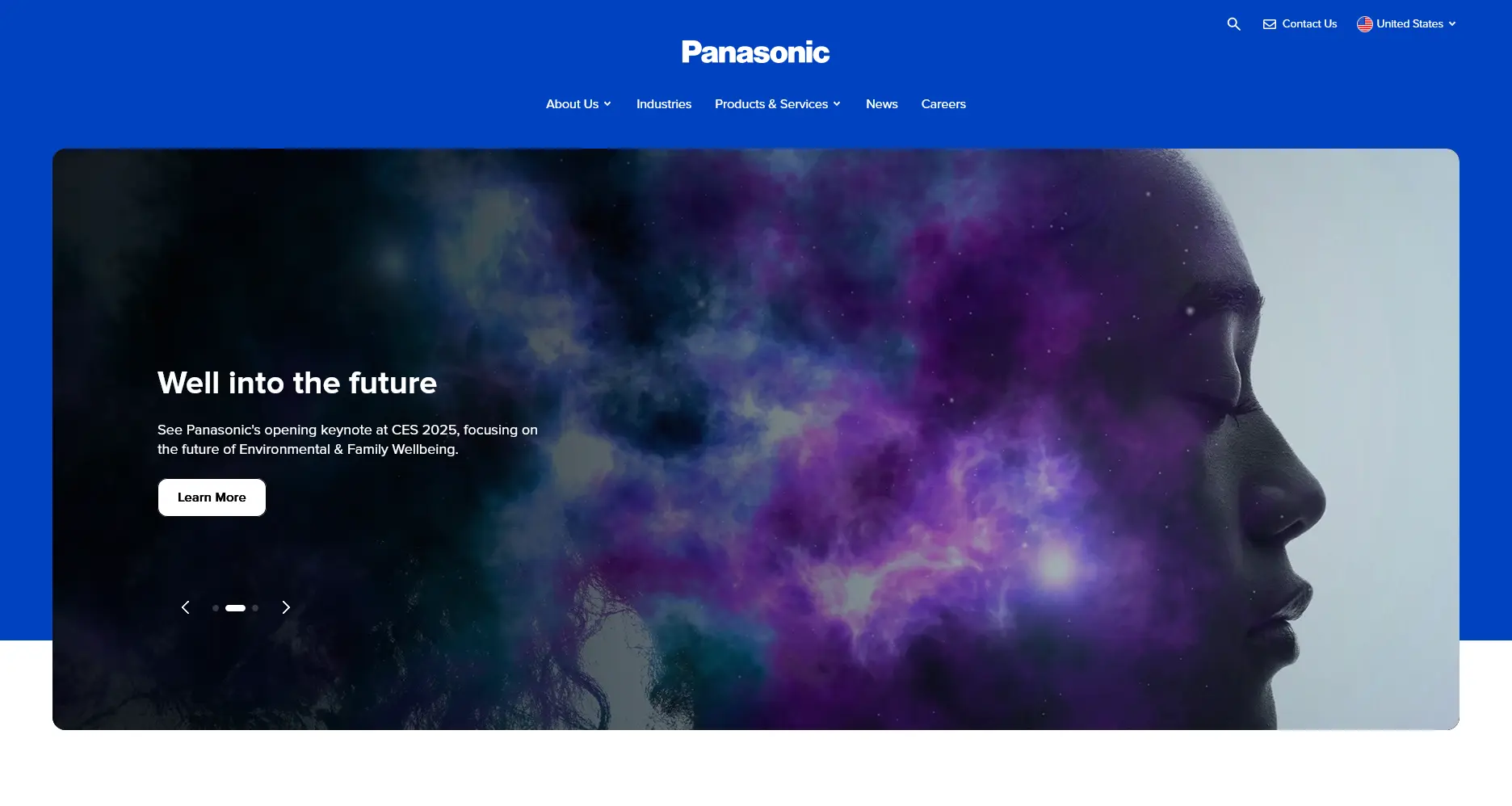
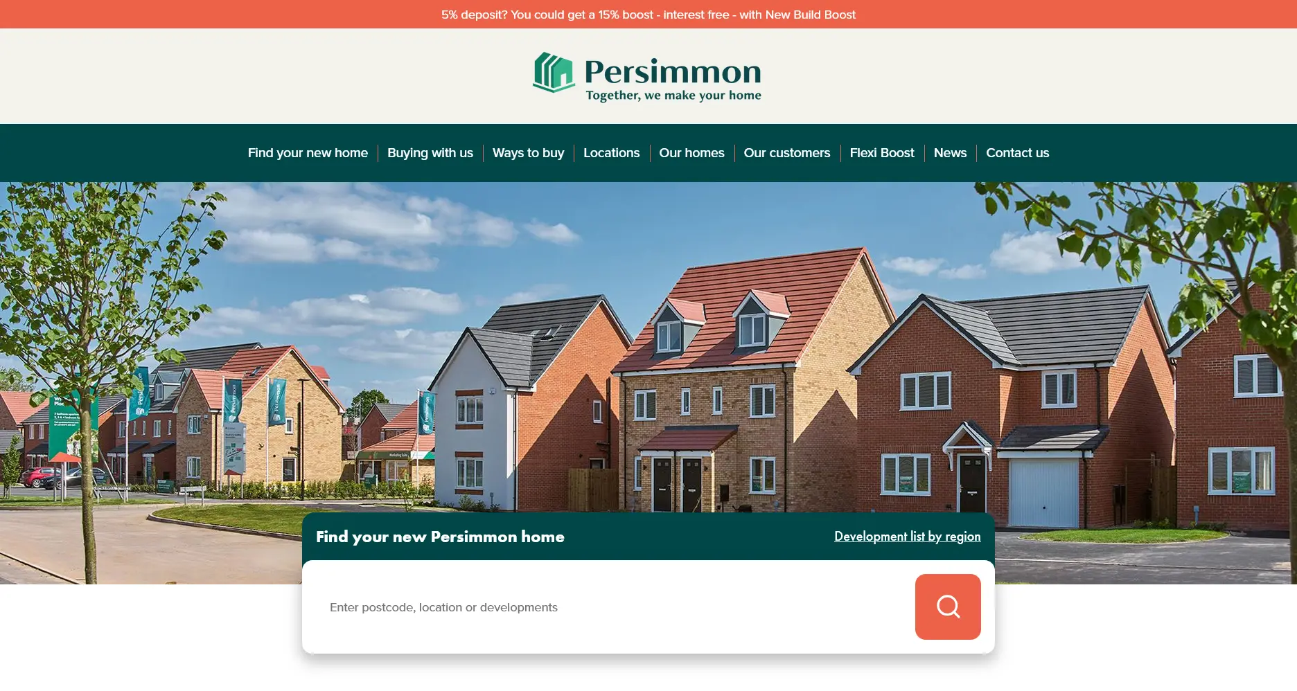
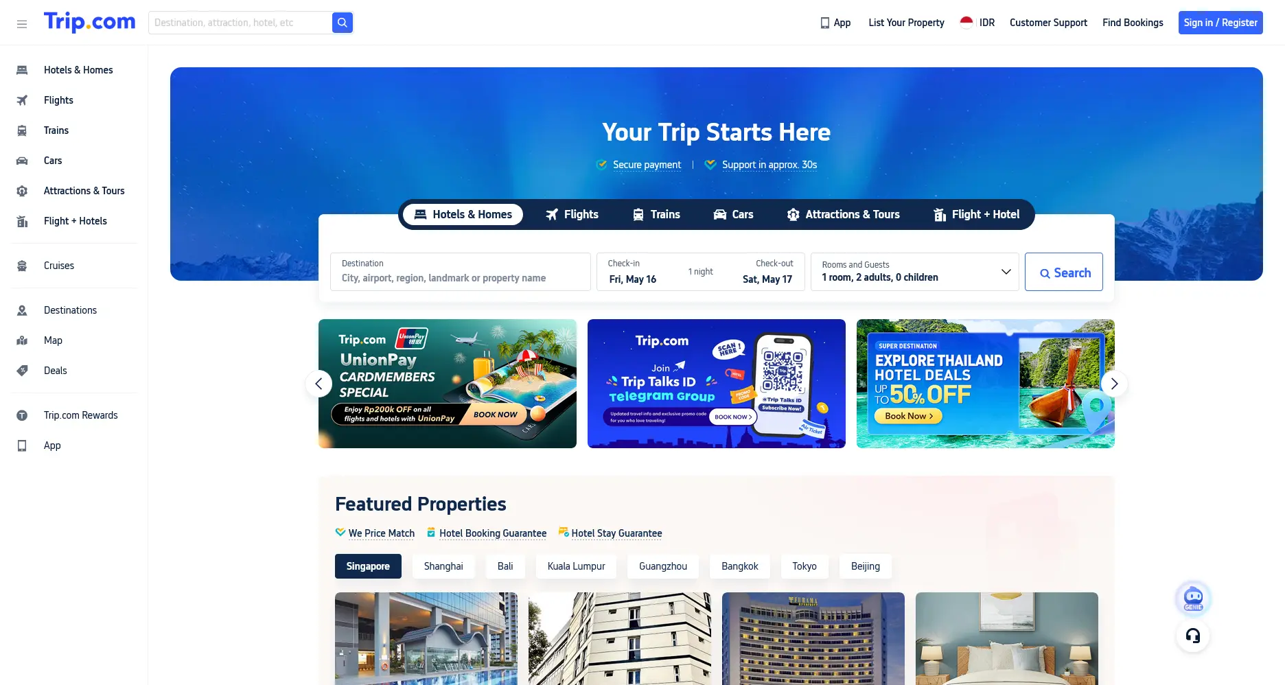
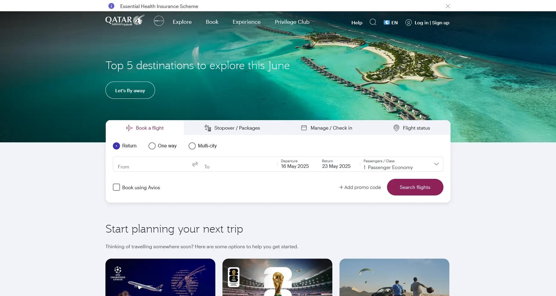
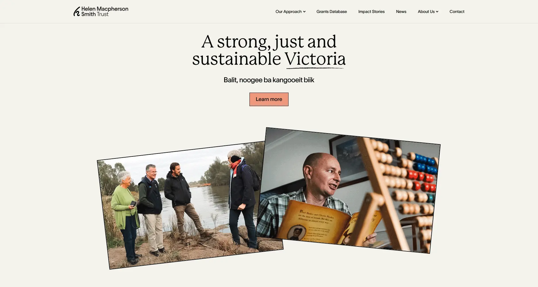
The five examples above illustrate how simple it is to break the web layout. Almost all the examples in this article use the same technique, yet we'll see how just playing with these few attributes can give a different character out of most websites.
Grid Layout
When discussing web layouts, it's worth revisiting the old days when news media websites like The New York Times struggled to organize information on their homepages. So, they took the only realistic approach which required abusing the table layout. To break up the layout to make it as appealing as physical newspaper, they literaly placed tables inside a table recursively and set the table data cells to different widths. Since we always have colspan and rowspan, so sometimes we prefer them rather than creating separate tables. To accommodate the responsive design needs, news media websites moves to using flexbox so that the columns can wrap automatically when the screen width is less than a certain size.

Depends on the type of business of the client you're working with or a potential business you're thinking of, this layout may be the only one you need after all. But hey, maybe we just want a table layout anyway. Well, even in this modern age, people still use tables to create sophisticated designs.

table elements to layout their pages.
If we want each item to be evenly sized and distributed, look no further than a grid layout. Or a combination of the two as on the The New York Times website.
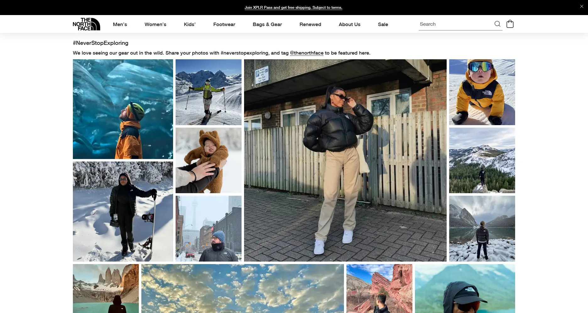
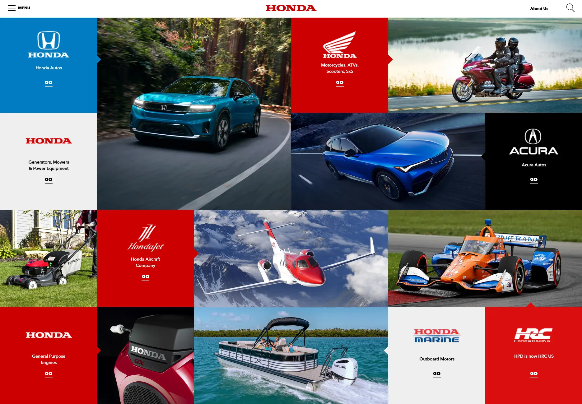
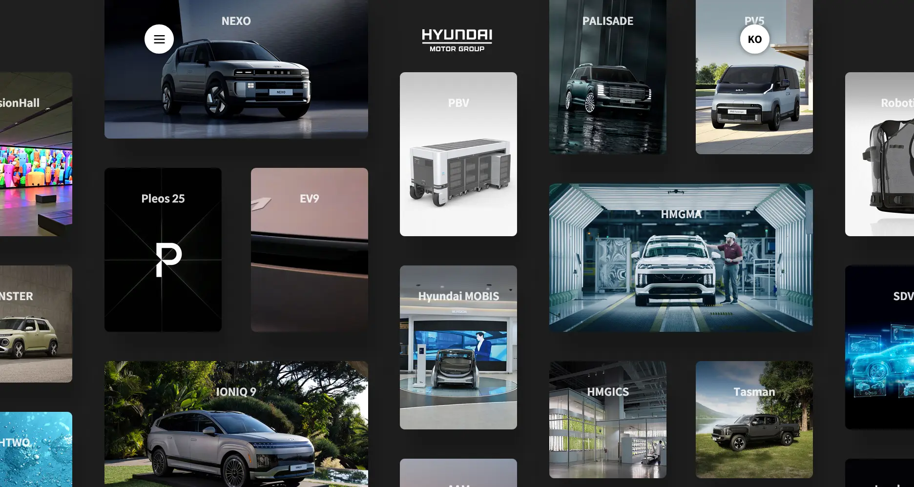
It's not that boring, isn't it? Since we all love photo collages. This kind of layout is also known as a bento grid which we often see in every latest Apple WWDC.
Want something more organic? I heard someone call it a deliberate random layout design—sorry if that sounds weird as it's being translated to English.
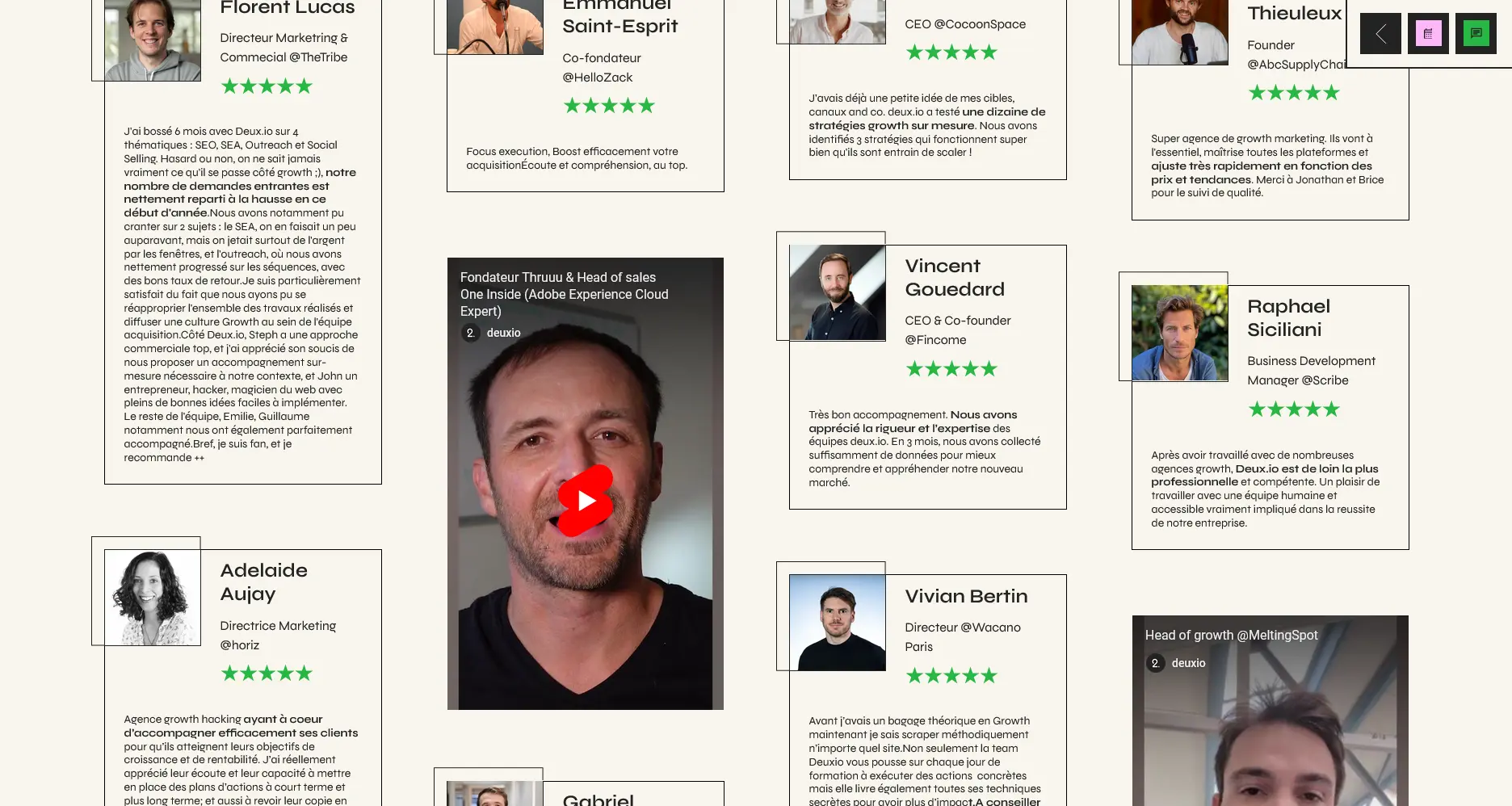
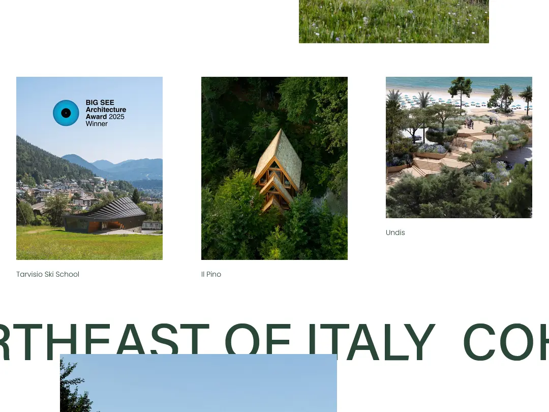
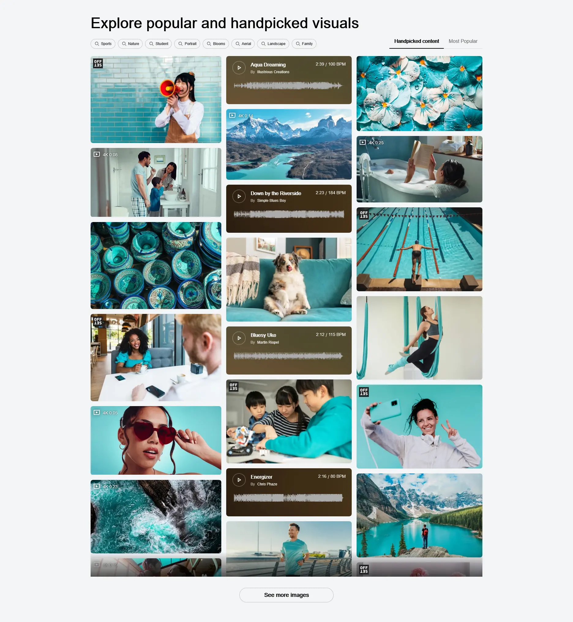
If you ask, I have no idea either how on earth they can come up with this idea. Maybe less brutal then? Why not trying a mansory grid?
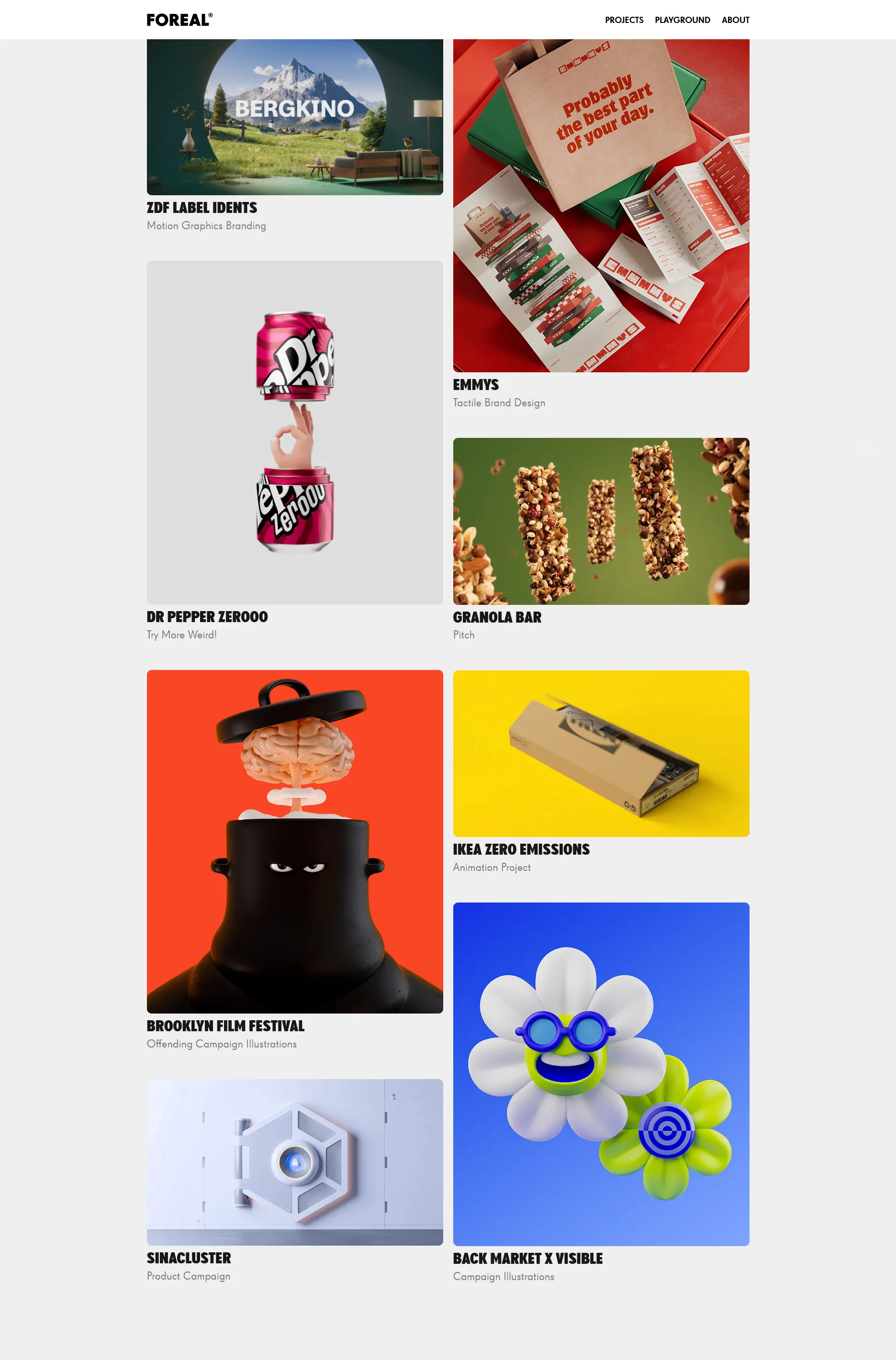
Okay, even more simple but still creative:


What do you think?
Card List
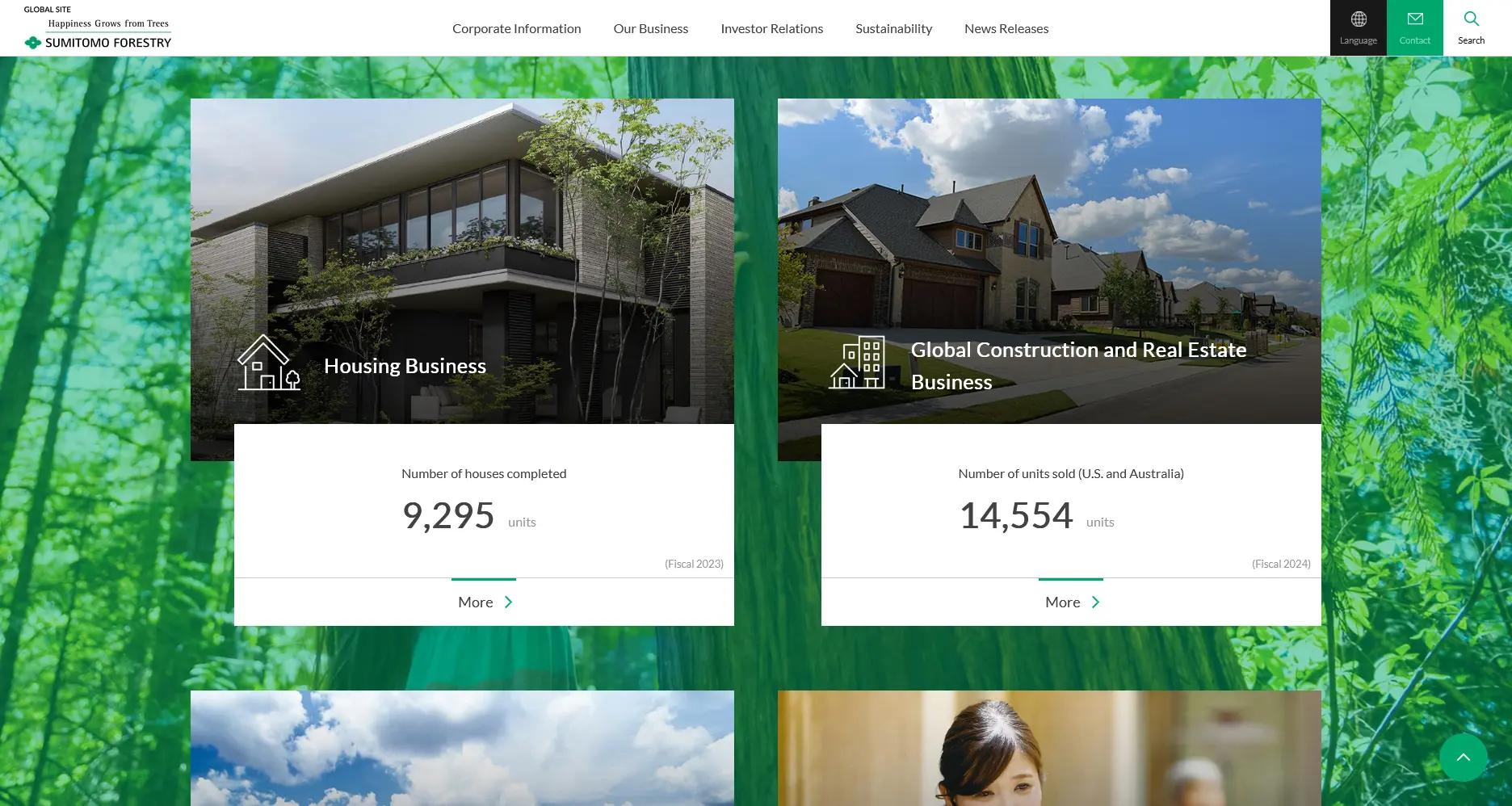
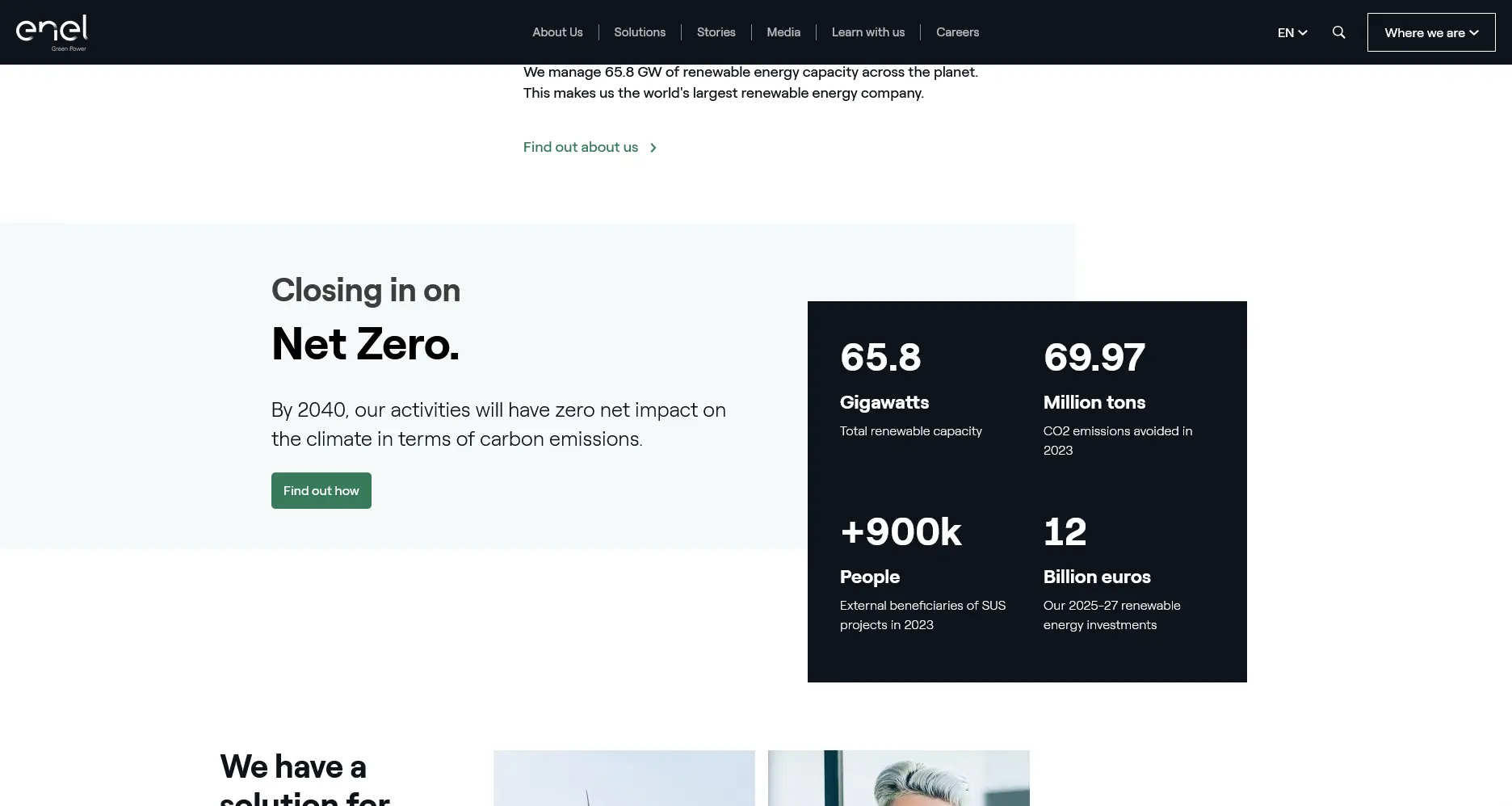
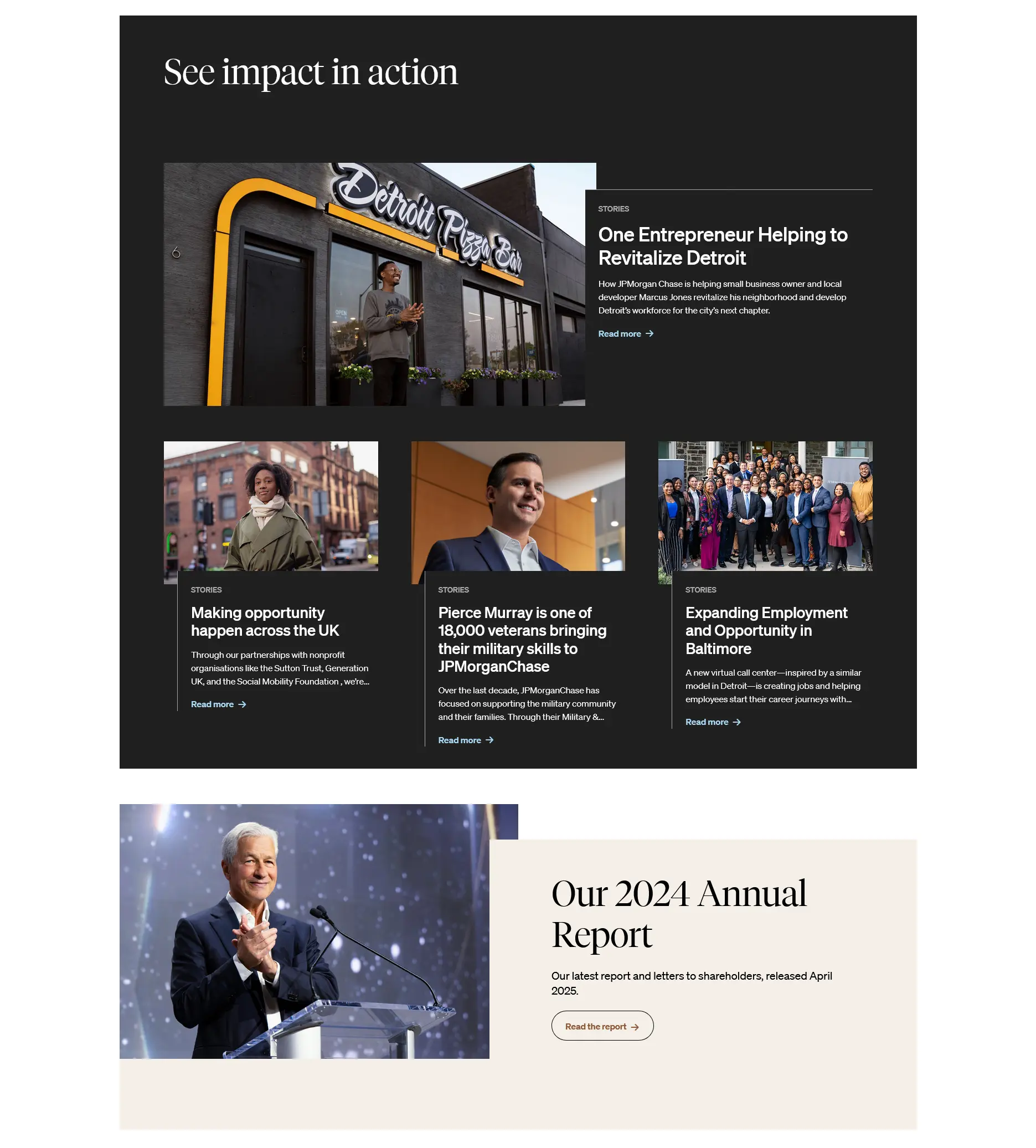
Shifting elements vertically is not only to add visual interest, but sometimes also to add hierarchy so that some elements can appear earlier than others as the user scrolls. Give yourself a chance with this layout as it gets less complicated to look and implement:
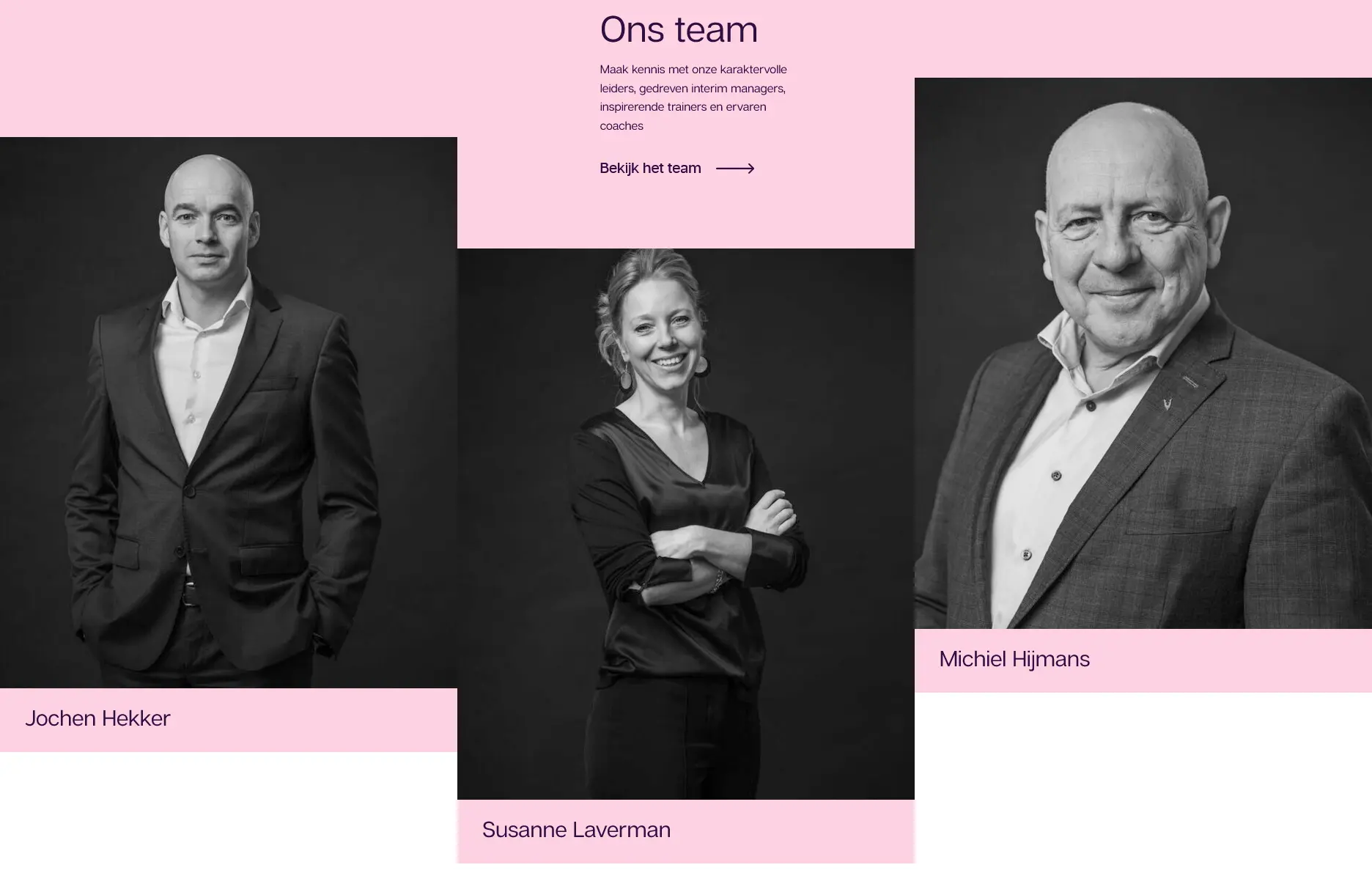
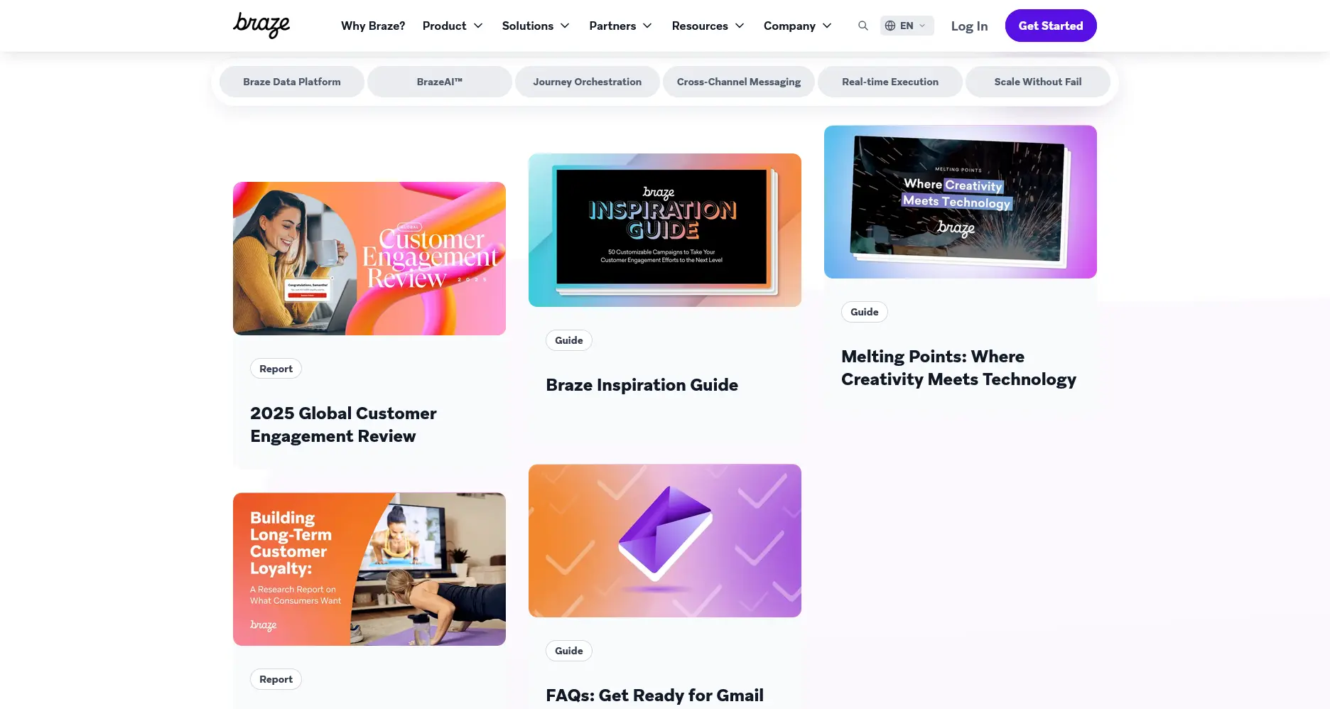
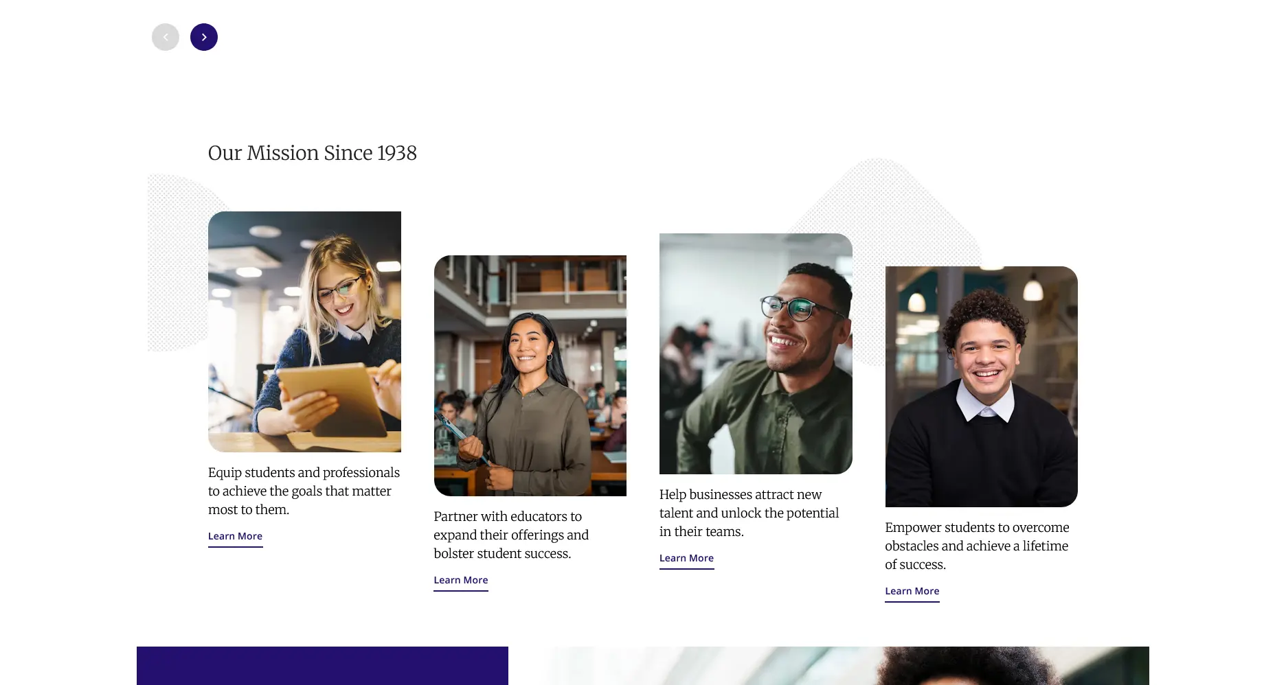
What if we only want to adjust either the image or the content of each card? Let's see below.
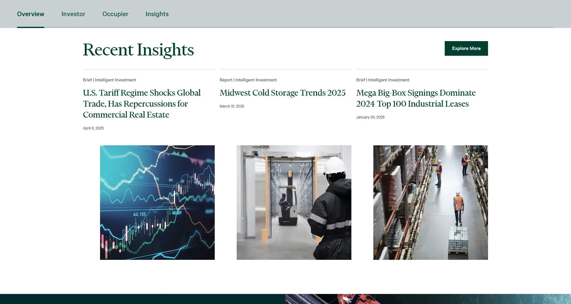
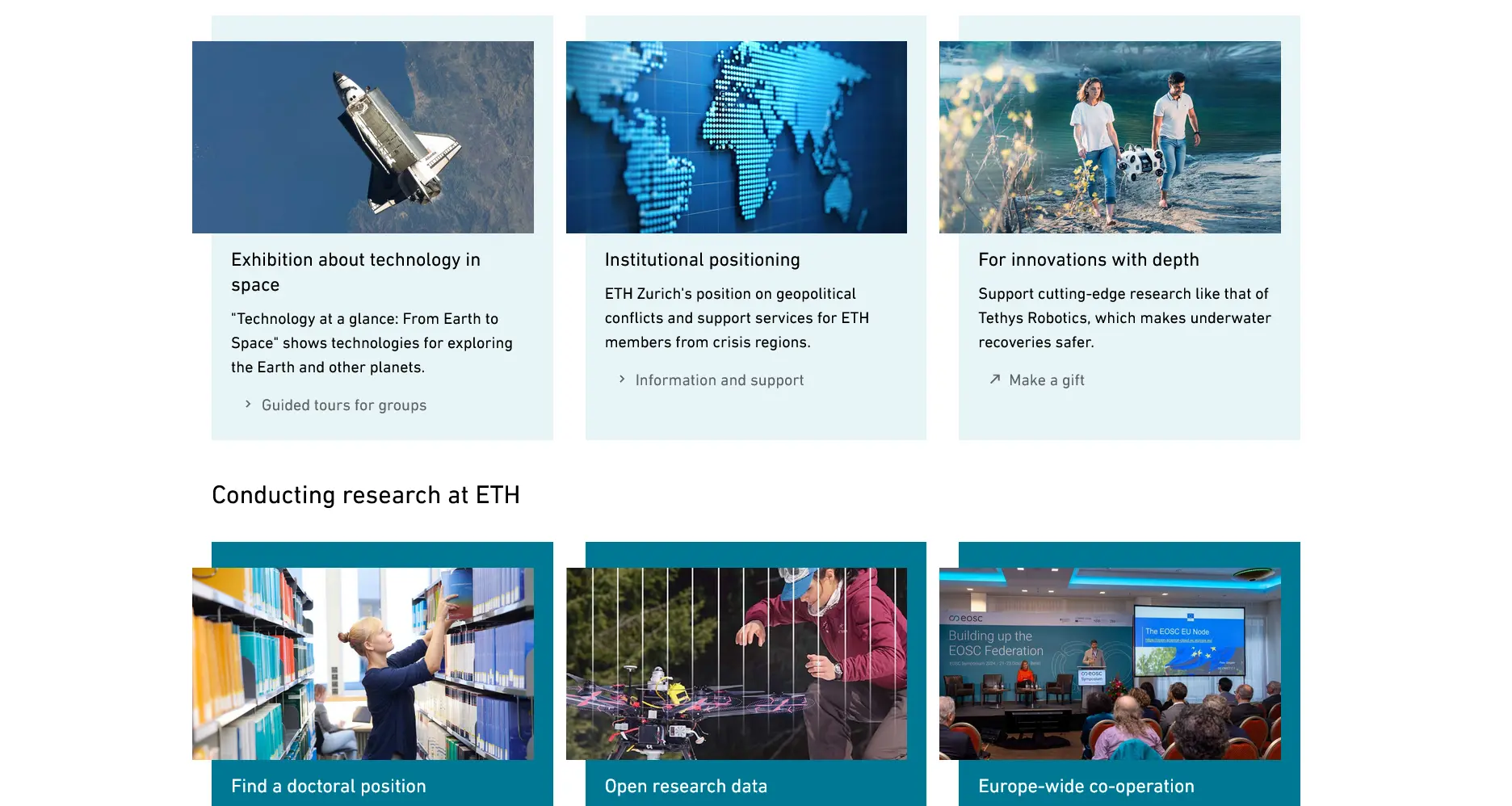
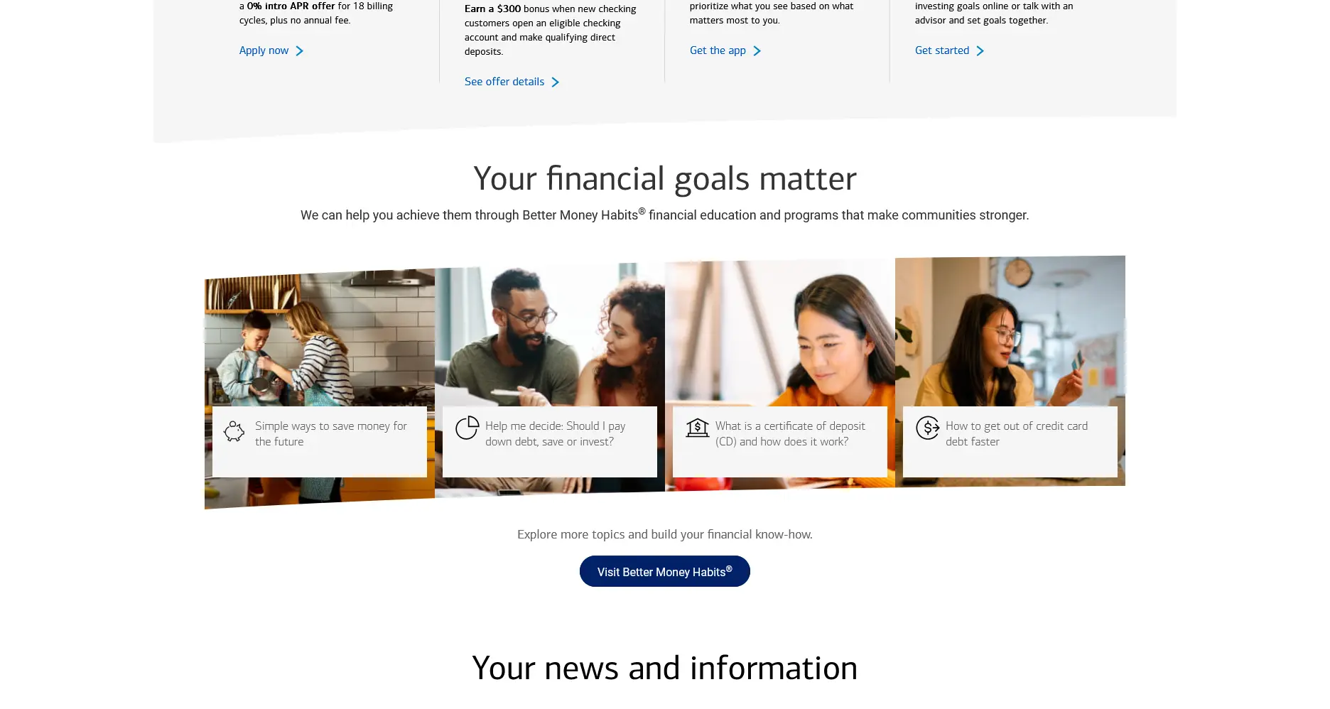
A final example that might make the layout looks breaking is by creating the subtle illusion that the cards aren't aligned with each other on the vertical axis, when in fact we're simply using a technique we learned in the previous article.
Call-to-Action
This call-to-action section is another place where we can test our newly ideas.
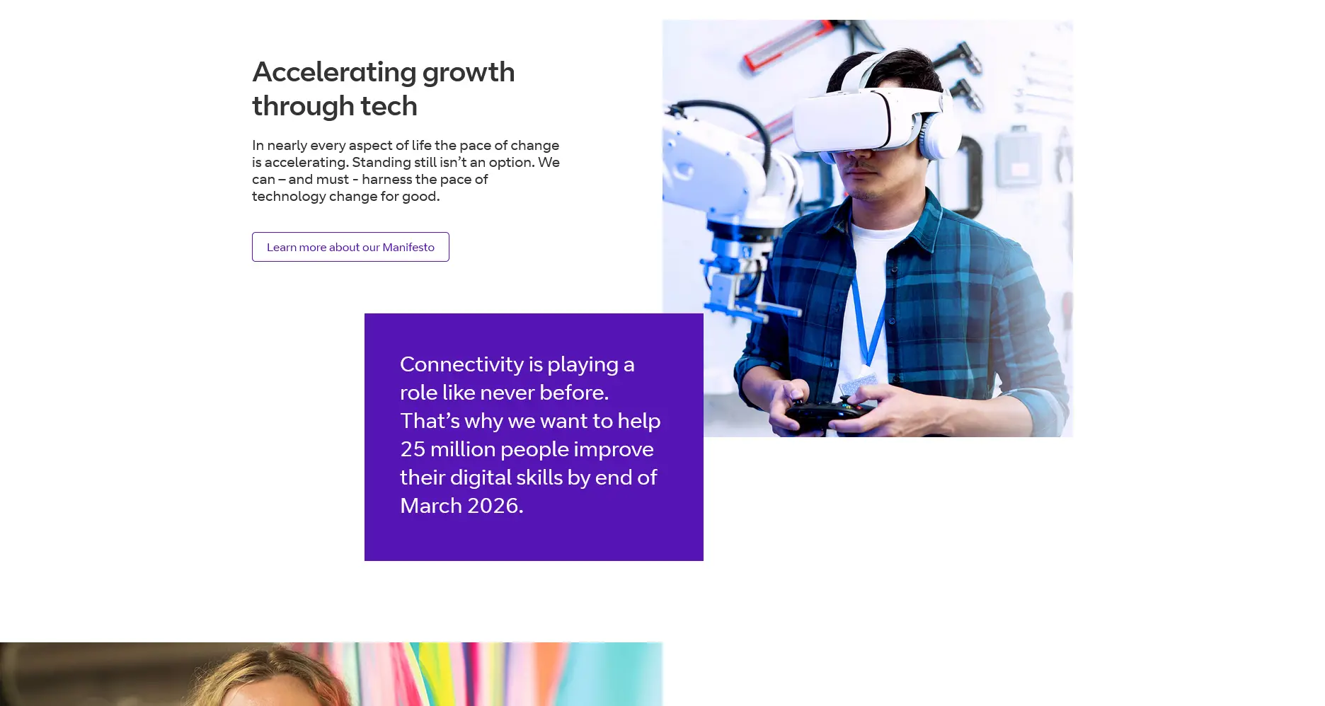
Playing with three-dimensional perspective can also add character to the design.
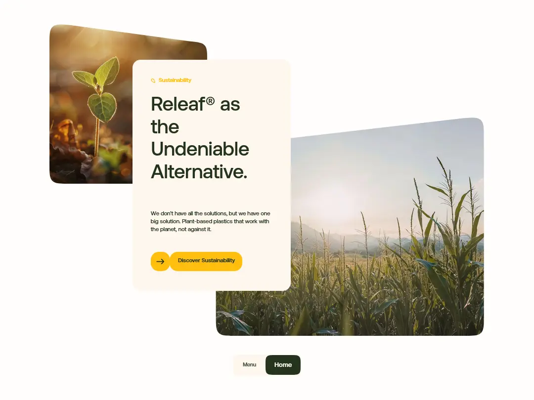
Especially when the element transformation can changes as the user interacts with the cursor.
Carousel
Carousels, despite their pros and cons in UX studies, still seem to be used frequently and are therefore not immune to the influence of creative experimentation.
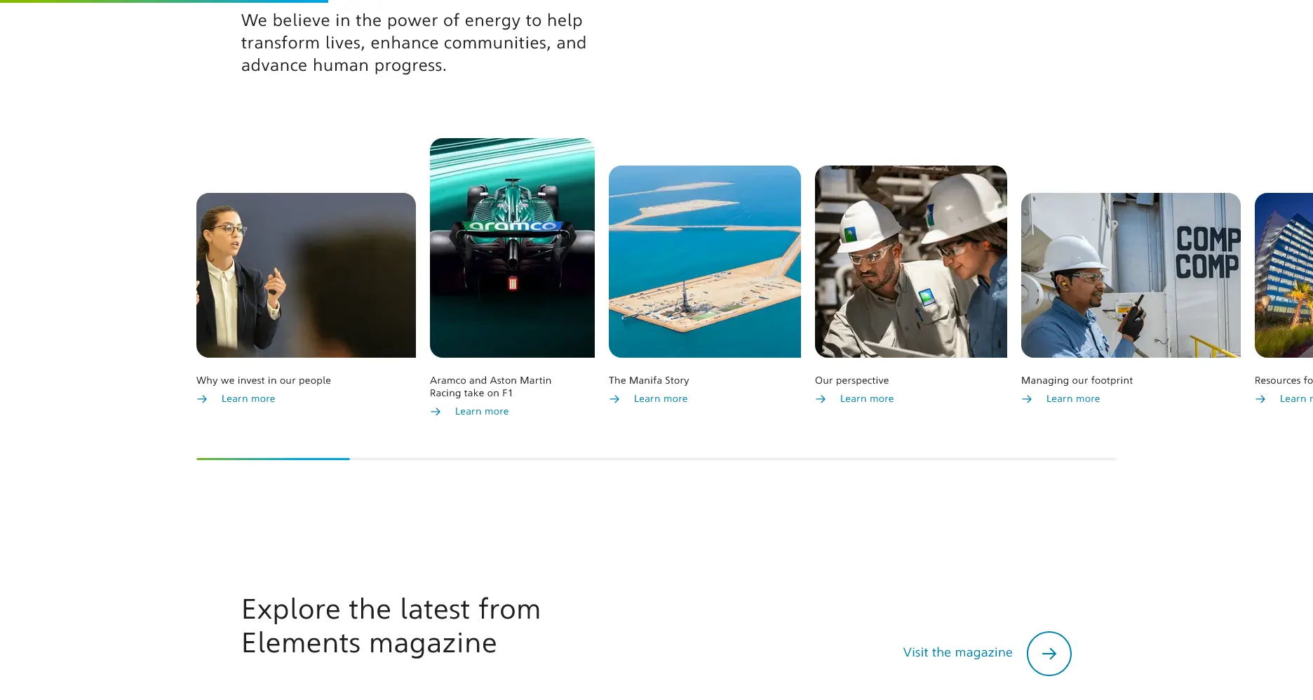
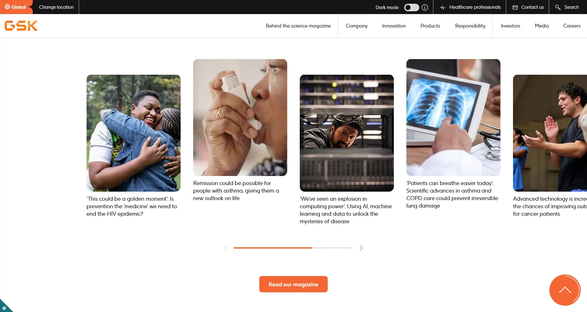

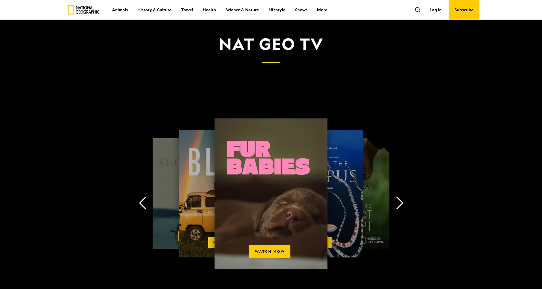
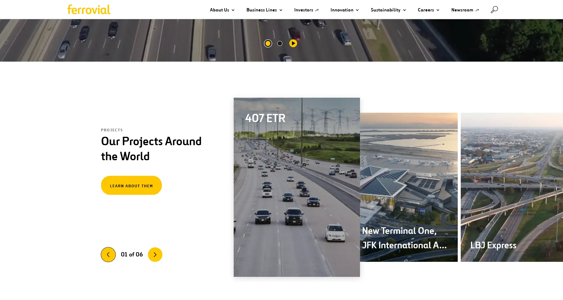
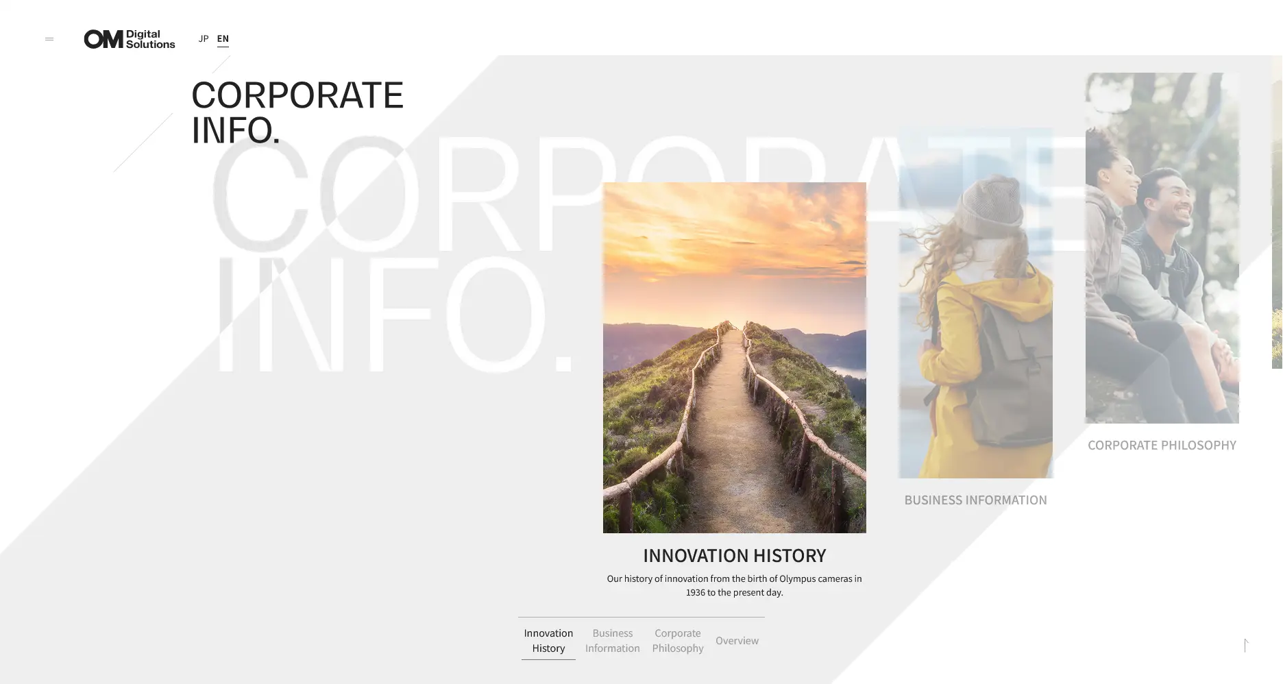
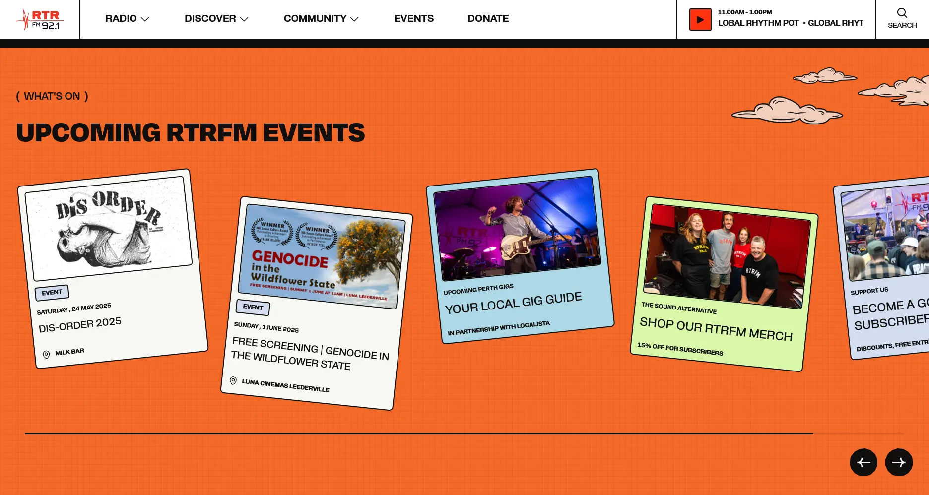
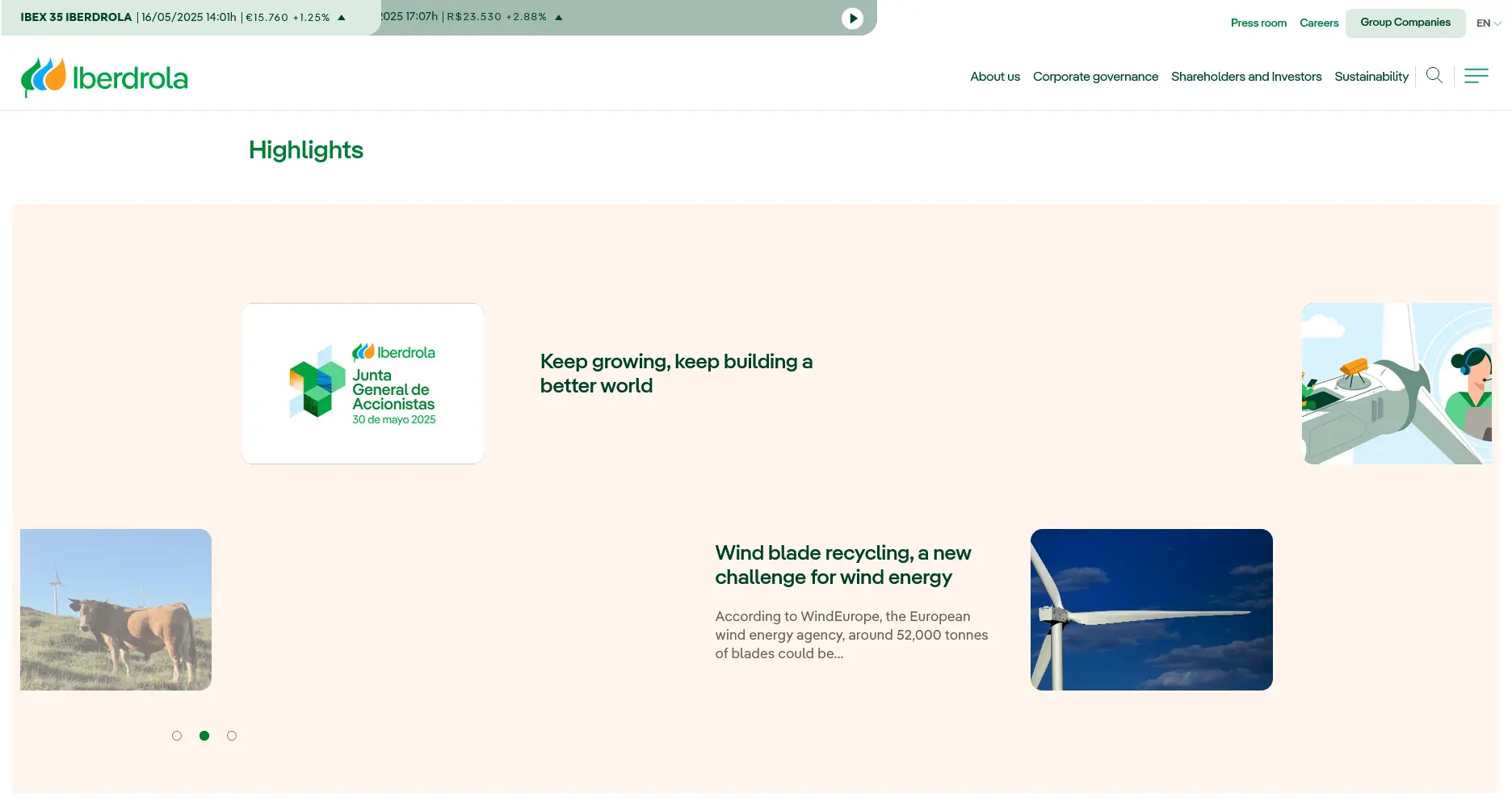
Forget not to always consider common design pattern so that our potential customers won't regret coming to our website. Breaking something doesn't mean breaking everything, right?
Paragraph Breakout
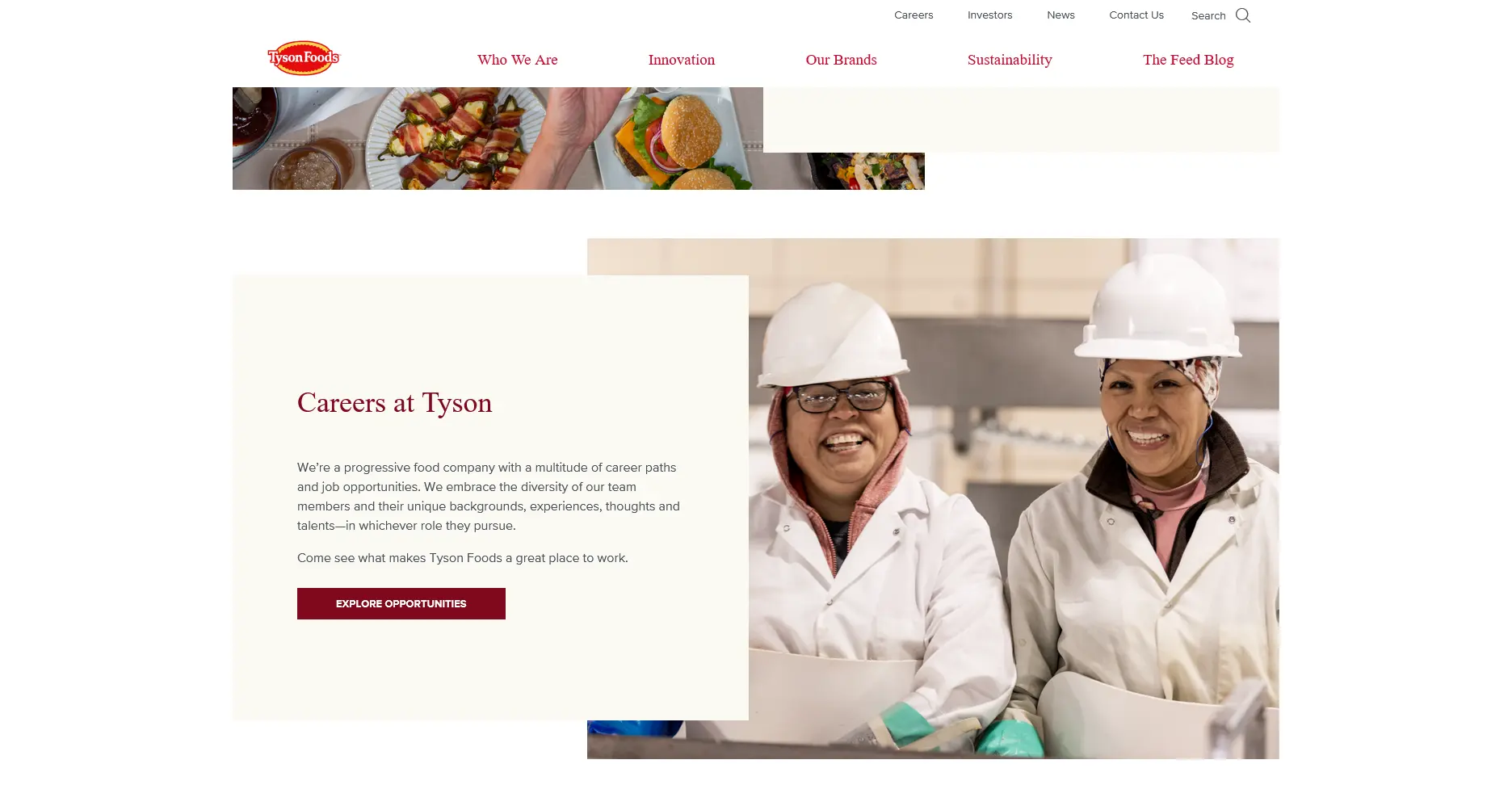
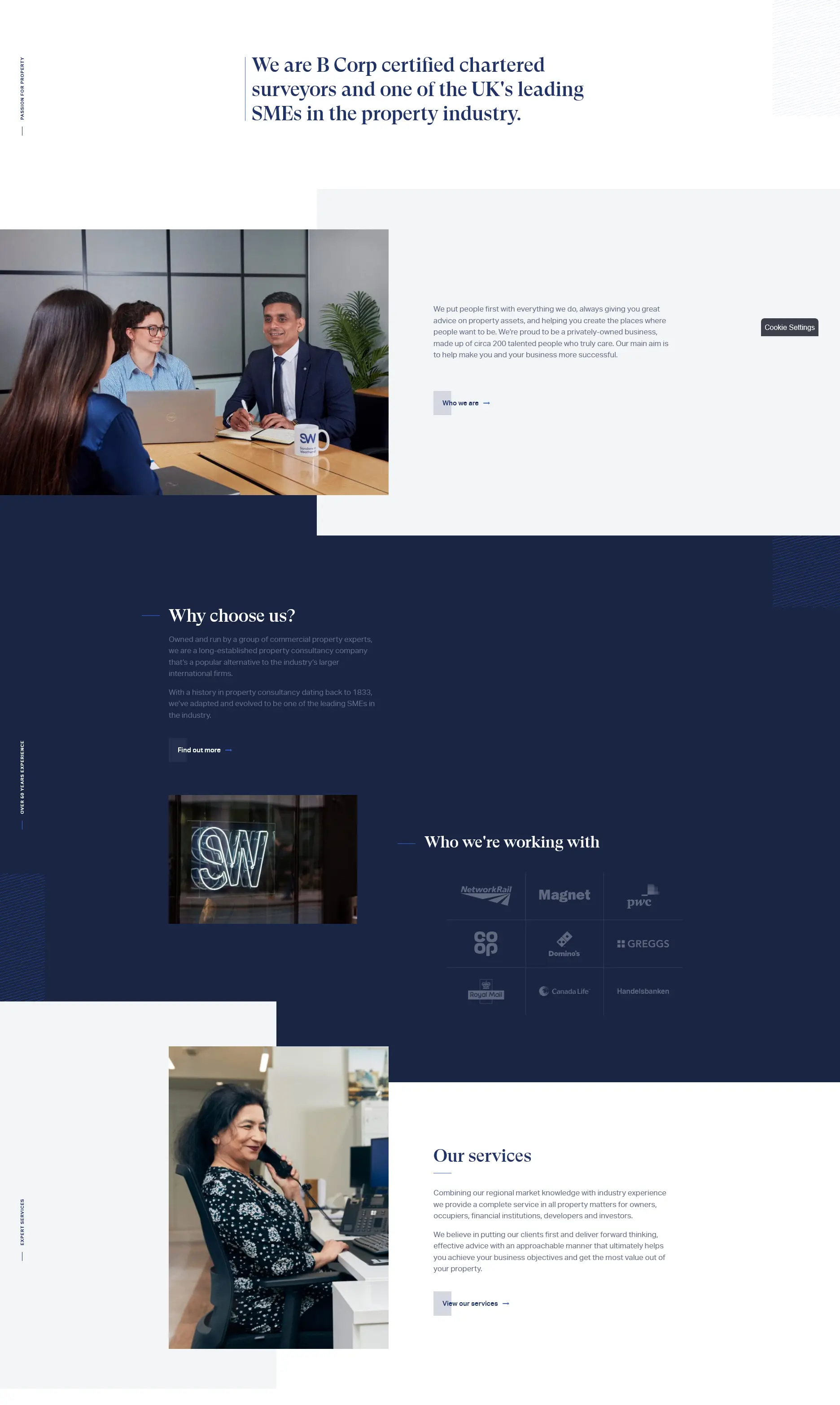
The float attribute has been around for over two decades; it's been there since the first version of Safari, as well as the first versions of both Chrome and Firefox on the desktop. Its adoption is getting really high—according to Chrome Platform Status—so that it's easy to find float attribute on the code more than flex-* and grid-* which are the new CSS layouts released around 2013 and 2017 respectively—as shown in the browser compatibility table on MDN website. Yet when it comes to articles, it's not that easy to spot them on today's leading blogging platforms such as Medium, DEV, and Substack.
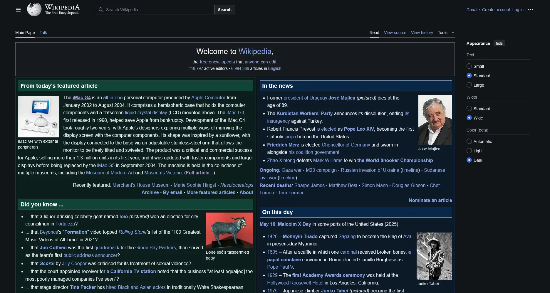
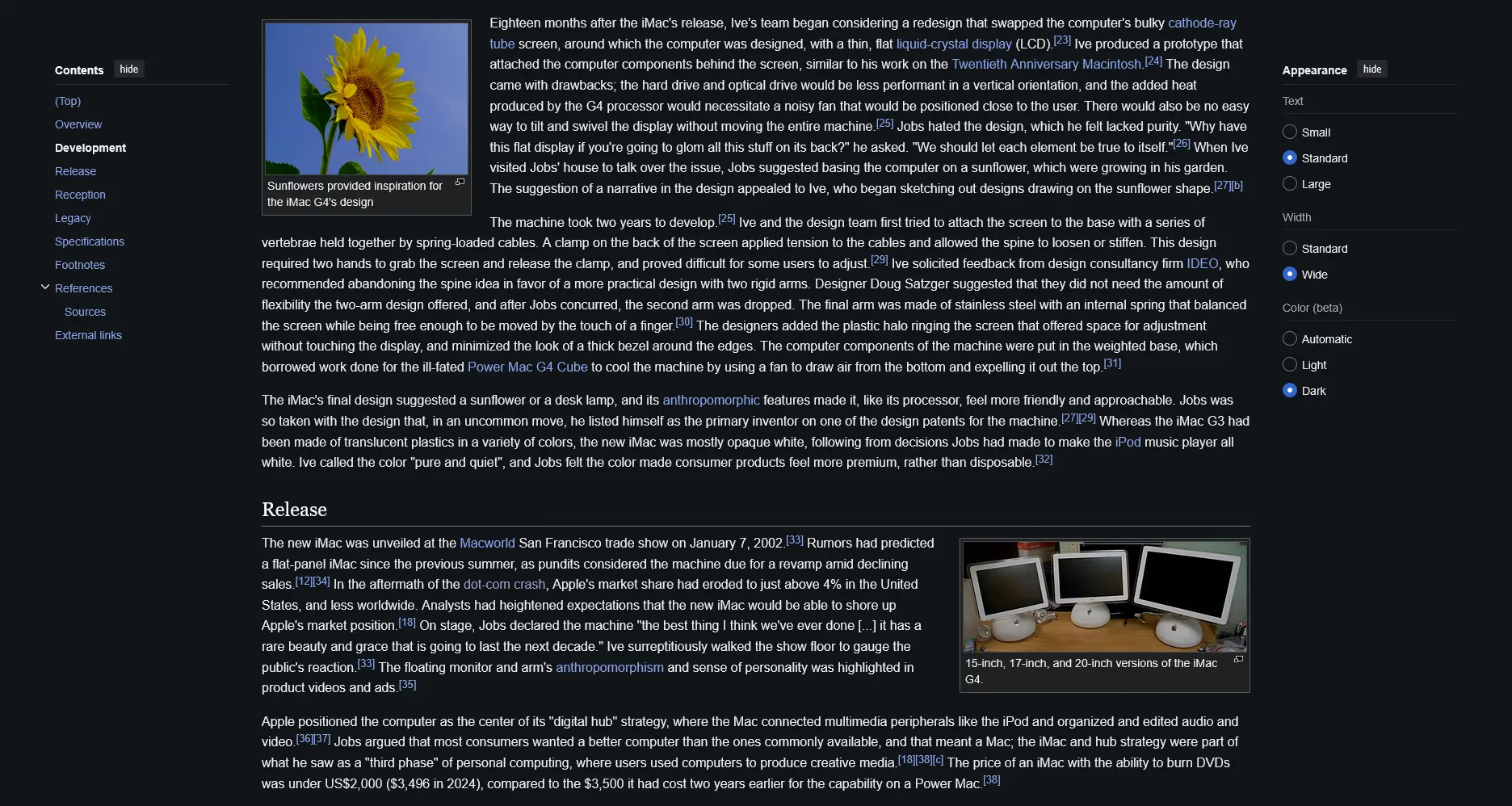
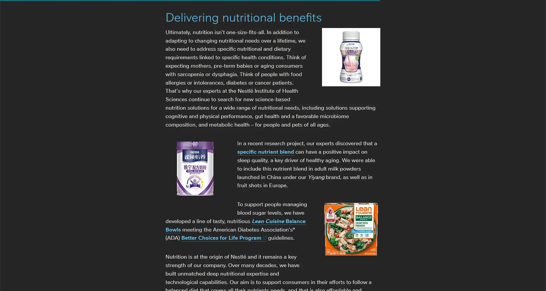
Nowadays, the majority of website layouts are far too simple, especially since the emergence of flexbox and grid layouts in major browsers. Or maybe since the rise of the mobile-first design philosophy which seems to be misunderstood by some people. Anyway, I still have some faiths that this particular layout is and will still be used by large established companies, but just not by media companies like The New Yorker, The Atlantic, and The Economist.
I can relate though when many people complain about the unpredictable behavior caused by the float attribute. Ultimately, the feature makes a layout more attractive, as well as increasing the density of information. Use when appropriate, but with caution.
Moreover, we can use the shape-outside attribute to add interesting non-rectangular shapes around adjacent inline content.
Article Breakout
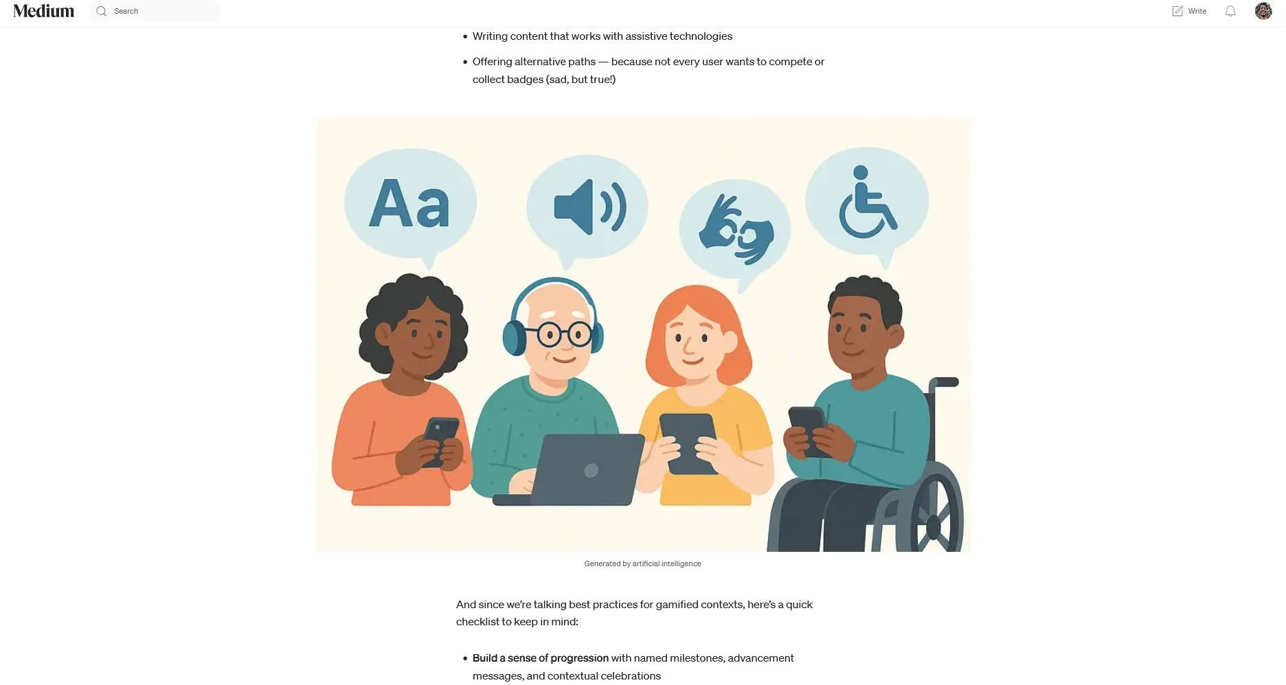
A less brutal approach might be what we call a layout breakout—just google it ourselves&mdash, yet it doesn't seem to be straightforward to implement as a beginner web developer. However, it's rather easy once we get to see a code example. We may want to use a tool for that instead of coding it ourselves from scratch—it won't be considered a taboo :)
Drop Cap
Remember when the last time we saw drop caps in either physical books or the digital realms?
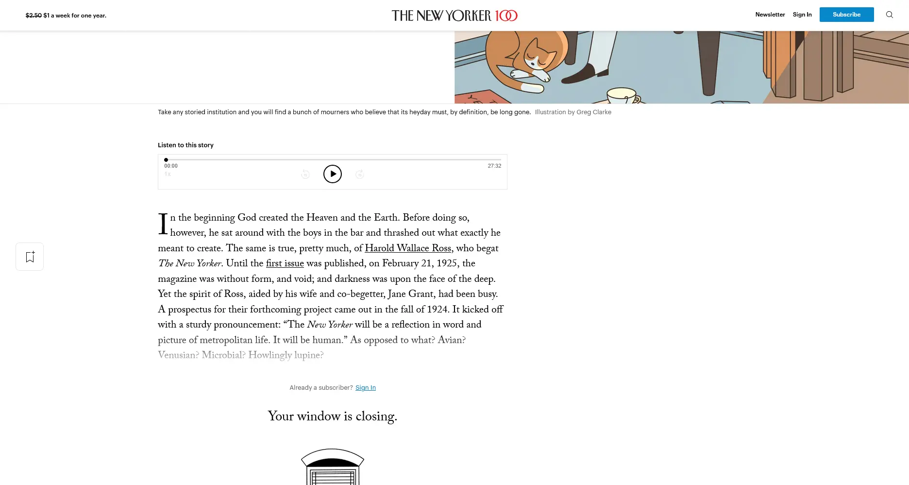
Ah, yes, the initial-letter hasn't gained widespread support, but still it's possible to replicate what The New Yorker has been doing.