Non-Rectangular Images in Web Design: Think Beyond Commonalities
Series: Exclusive Web Design—Part 1
Rounded edge screens have been gaining popularity lately, especially on mobile devices. Curved corners have been ubiquitous in user interface design for a long time. Physical goods, although may introduce to additional manufacturing costs, are designed to have smooth corners so that they don't hurt the parts of our body that come into contact with them. Natural objects don't have sharp edges—if they do at any given time, they will become blunt over time—; basically they're never rectangular in the sense that they don't have 90-degree angles.
However, it's hard not to get attached to rectangular images. Our camera sensors are rectangular, so are the resulting images. Not to mention everything in web design is expressed as boxes. In some circumstances, even we're tied to rectangles. For example, Google Play Store requires app icons to be square and discourages rounded corners in the original asset.
While there are some scientific discussions and intuitive studies in the fields of history, psychology, and neurology, supporting non-rectangular shapes in the web domain can open up new opportunities to express our brand more accurately. Sometimes the shape cannot be simple, but must be made of two or more visual objects by applying certain boolean operations.
In this article:
Rounded Corners
The simplest way to have a non-rectangular shape is to adopt the border-radius property. At the very least, we can technically eliminate the right angle from any of the four corners referring to the definition of the rectangle itself.
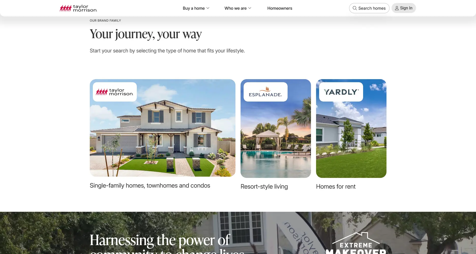
img { border-radius: 24px; }
img { border-radius: 0px 0px 75px 0px; }
img { border-radius: 30% 0; }

img { border-radius: 50%; }


Below is the complete reproducible code for each variant as discussed above.
.viewport {
    box-sizing: border-box;
    padding: 5vmin;
    width: 100%;
    display: flex;
    flex-wrap: wrap;
    justify-content: center;
    align-items: center;
    gap: 5vmin;
    background-color: #FFF;
    counter-reset: count;

    .image {
        position: relative;
        height: 25vmin;
        width: auto;
        aspect-ratio: 1;
        background: url("...") center / cover;
        counter-increment: count;
        overflow: hidden;

        /* This part is the most important */
        &.image-1 { border-radius: 20%; }
        &.image-2 { border-bottom-right-radius: 20%; }
        &.image-3 { border-radius: 40% 0; }
        &.image-4 { border-radius: 50% 50% 0 0; }
        &.image-5 { border-radius: 20% 40% 60% 30%; }
        &.image-6 { border-radius: 50%; }
        &.image-7 { border-radius: 12.5vmin; aspect-ratio: 55 / 25; }
        &.image-8 { border-bottom-right-radius: 100%; }

        &::after {
            content: counter(count);
            position: absolute;
            inset: 0;
            display: grid;
            place-content: center;
            font-size: 8vmin;
            font-weight: bold;
            background-color: #0009;
        }
    }
}
<div class="viewport">
    <div class="image image-1"></div>
    <div class="image image-2"></div>
    <div class="image image-3"></div>
    <div class="image image-4"></div>
    <div class="image image-5"></div>
    <div class="image image-6"></div>
    <div class="image image-7"></div>
    <div class="image image-8"></div>
</div>
Overlay Decorations
Another way to make our images not look rectangular is to place decoration shapes on top of them.

.hero-content::before {
    background-image: url('data:image/svg+xml,<svg><path d="..."/></svg>');
    background-position: center -10px;
    background-repeat: no-repeat;
}
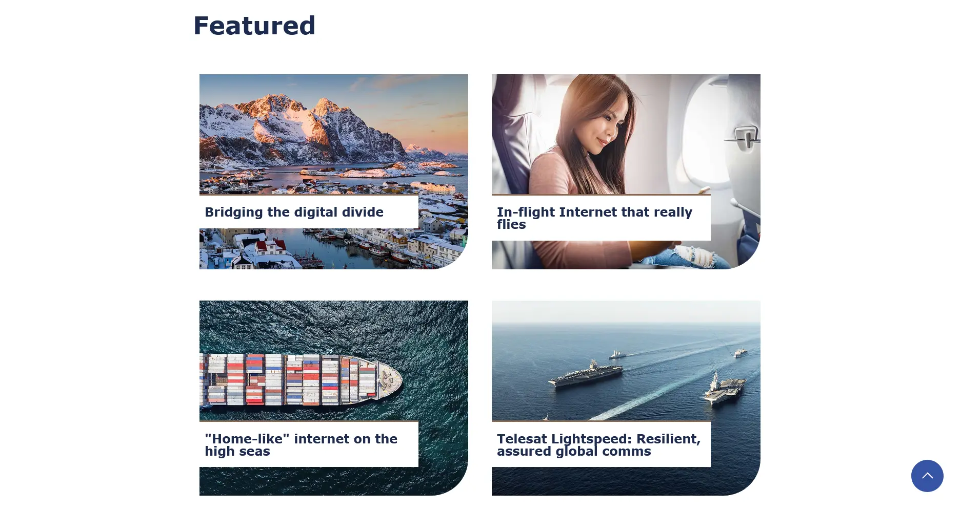
<img style="width:100%;object-fit:contain;" src="...">

.section-image::after {
    /**
     * Teck actually use a bitmap, but it can
     * be reproduced using CSS gradient functions.
     */
    background: linear-gradient(...);
    transform: skew(-20deg);
}
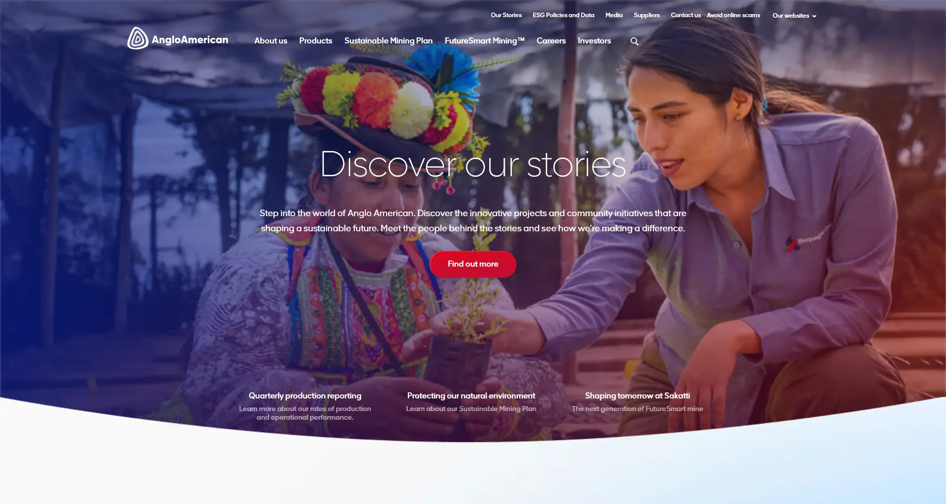
div element with a gradient background and applies a skew transformation to give the shape a character. BDO does similar thing on their hero section.
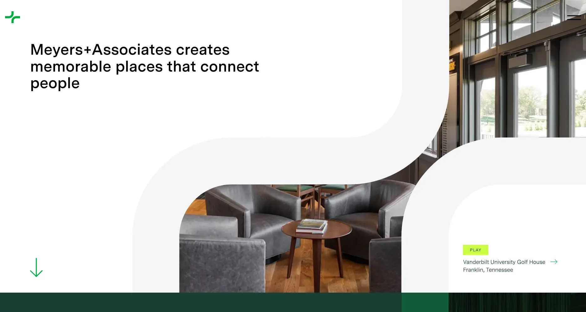
<div class="absolute inset-0 object-cover w-full h-full">
    <svg viewBox="0 0 1457 944" fill="none" xmlns="http://www.w3.org/2000/svg">
        <path d="..." fill="#FFFFFF"></path>
        <path d="..." fill="#F5F5F5"></path>
        <path d="..." fill="#F5F5F5"></path>
    </svg>
</div>
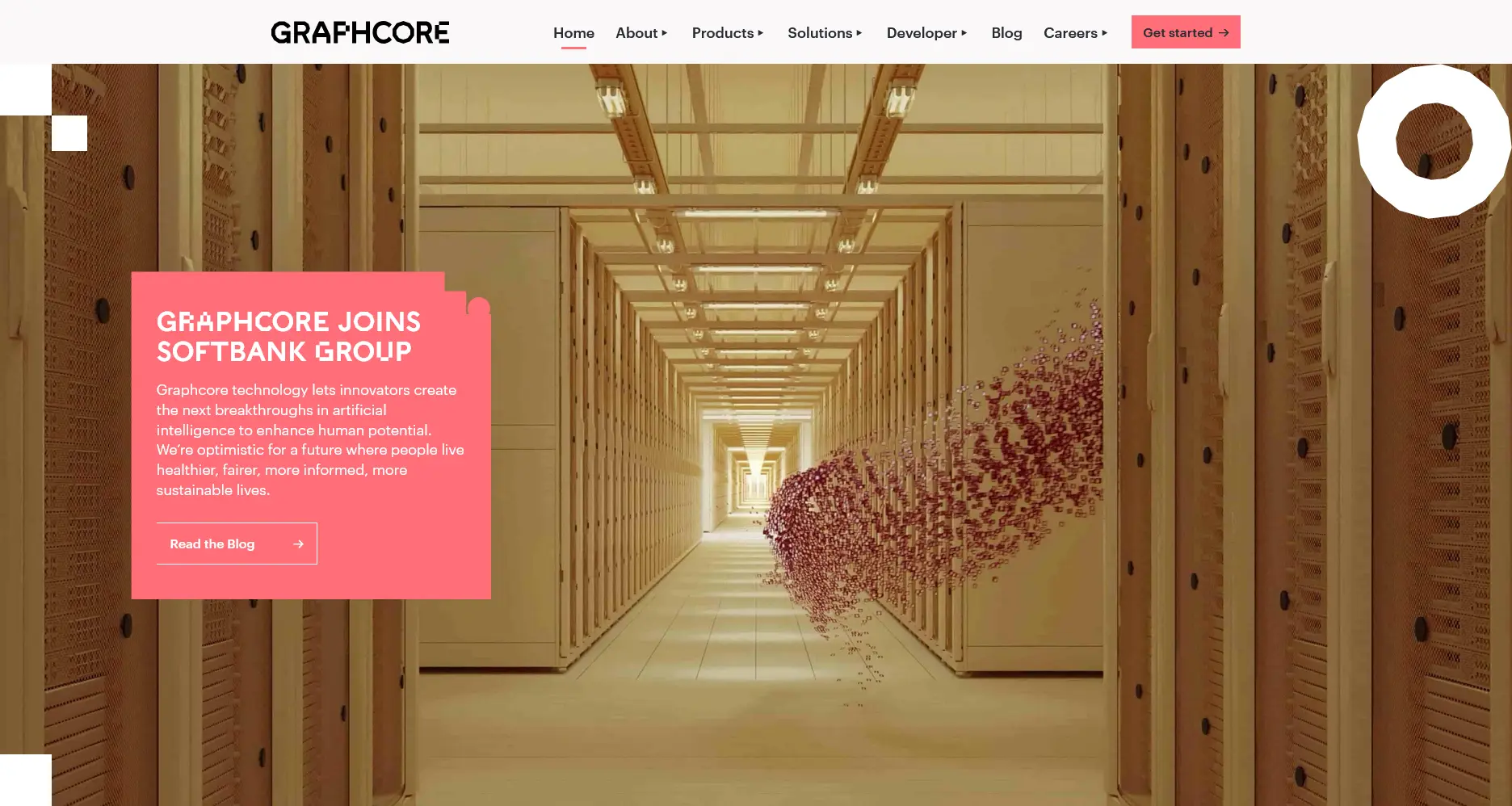
.shape.octagon {
    height: 192px;
    width: 192px;
    background-image: url("...");
    background-size: 100%;
}
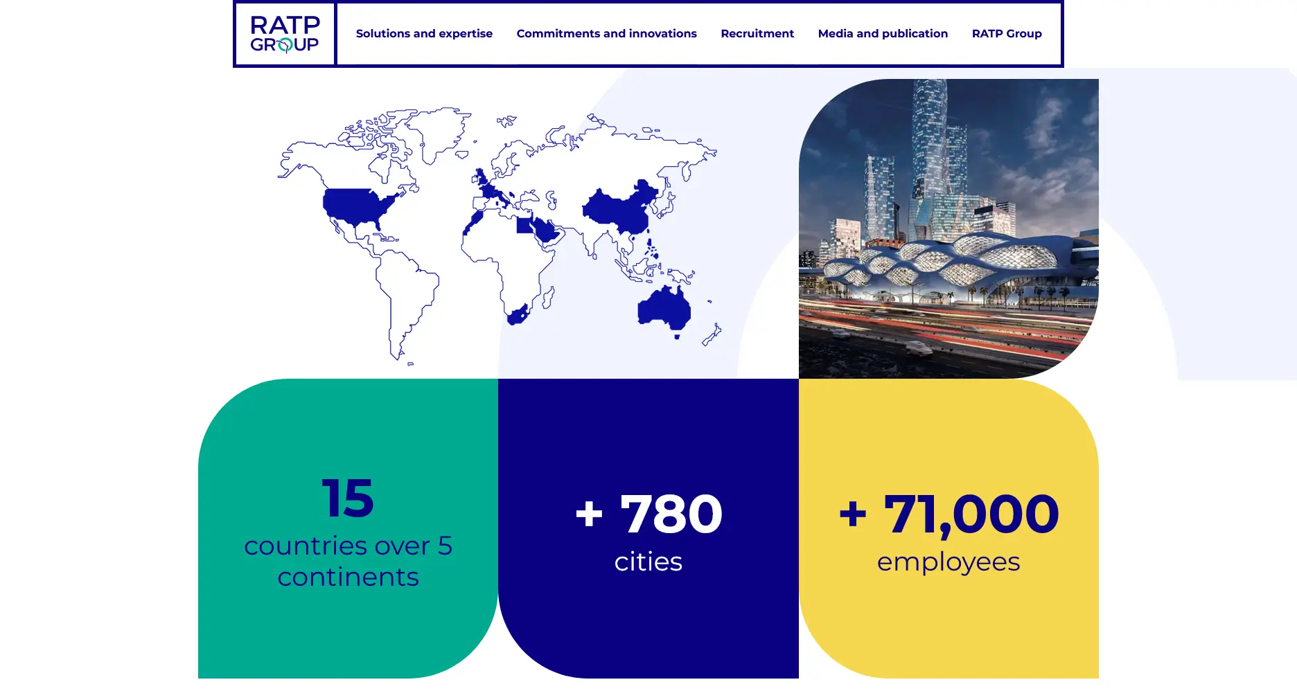
span elements with a solid white color and a span element with an SVG as the background image. Even only a simple block element with a solid background color can create the illusion of an attractive cutout image as illustrated on the BNSF homepage.

border-radius and some overlay decorative elements, we can produce a beautiful piece as shown on the Nutrien's page without having to write any SVG code. Want to take a guess on how to make the leftmost cut? Well, yes, it's rather hacky since we need to play with a transparent background and—guess what—a box-shadow.
Let's try making some of our own, shall we?
.viewport {
    box-sizing: border-box;
    padding: 5vmin;
    background-color: #FFF;
    overflow: hidden;

    .image {
        position: relative;
        margin-bottom: -5vmin;
        height: max(250px, 50vmin);
        width: 100%;
        background: url("...") center / cover;
        overflow: hidden;
        border-radius: 5vmin 5vmin 0 0;

        &::before {
            content: "";
            position: absolute;
            bottom: 10vmin;
            left: 0;
            height: 10vmin;
            width: 10vmin;
            background-color: transparent;
            box-shadow: -5vmin 5vmin 0 0 #FFF;
            border-bottom-left-radius: 5vmin;
        }

        &::after {
            content: "";
            position: absolute;
            bottom: 0;
            left: 0;
            right: 0;
            height: 10vmin;
            background-color: #FFF;
            border-top-right-radius: 5vmin;
        }
    }
}
<div class="viewport">
    <div class="image"></div>
</div>
.viewport {
    box-sizing: border-box;
    padding: 5vmin;
    background-color: #FFF;

    .image {
        position: relative;
        height: max(250px, 50vmin);
        width: 100%;
        background: url("...") center / cover;
        overflow: hidden;

        &::before {
            content: "";
            position: absolute;
            inset: 0;
            background:
                url('data:image/svg+xml,<svg width="160" height="160" xmlns="http://www.w3.org/2000/svg" fill="white"><path d="M 0 80 Q 40 0, 80 80 T 160 80 L 160 0 L 0 0 Z"/></svg>')
                left top / 100% 40% no-repeat;
        }

        &::after {
            content: "";
            position: absolute;
            inset: 0;
            background:
                url('data:image/svg+xml,<svg width="160" height="160" xmlns="http://www.w3.org/2000/svg" fill="white"><path d="M 0 80 Q 40 0, 80 80 T 160 80 L 160 160 L 0 160 Z"/></svg>')
                left bottom / 100% 40% no-repeat;
        }
    }
}
<div class="viewport">
    <div class="image"></div>
</div>
Object Masking
The final approach is to apply a mask or clipping path to the image. This creates more advantages but requires a willingness to deal with higher complexity.

.hero-media {
    mask-image: url("...");
    mask-position: 0 50%;
    mask-size: 2560px 2560px;
    mask-repeat: no-repeat;
    transform: translate(-50%, -50%);
    transition: mask-size 0.5s cubic-bezier(0.54, 0.09, 0.2, 0.92);

    &:hover {
        mask-size: 7680px 7680px;
    }

    img { ... }
}

img {
    mask: url("...");
    mask-repeat: repeat;
    mask-position-x: 0%;
    mask-position-y: 0%;
    mask-size: auto;
    mask-position: 0 center;
    mask-repeat: no-repeat;
    mask-size: cover;

    &:hover {
        transform: scale(105%);
        transition-duration: .3s;
    }
}
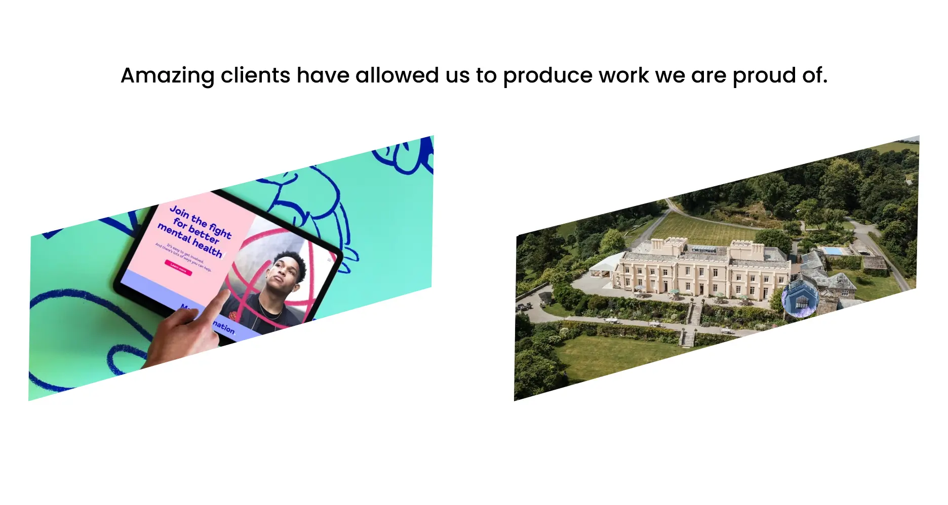
img {
    clip-path: polygon(25% 0%, 100% 0%, 75% 100%, 0% 100%);
    animation: animate-polygon 10s ease-in-out infinite;
}

@keyframes animate-polygon {
    0%, 100% { clip-path: polygon(25% 0%, 100% 0%, 75% 100%, 0% 100%); }
    25%, 75% { clip-path: polygon(0 39%, 100% 0, 100% 56%, 0 100%); }
    50%      { clip-path: polygon(0 0, 66% 0, 100% 100%, 24% 100%); }
}
clip-path so that the entire shape can be animated—not just it's transformation. Not only to an image, but we can also apply a clipping path to a video or even iframe as demonstrated by Oh planning+design, architecture.
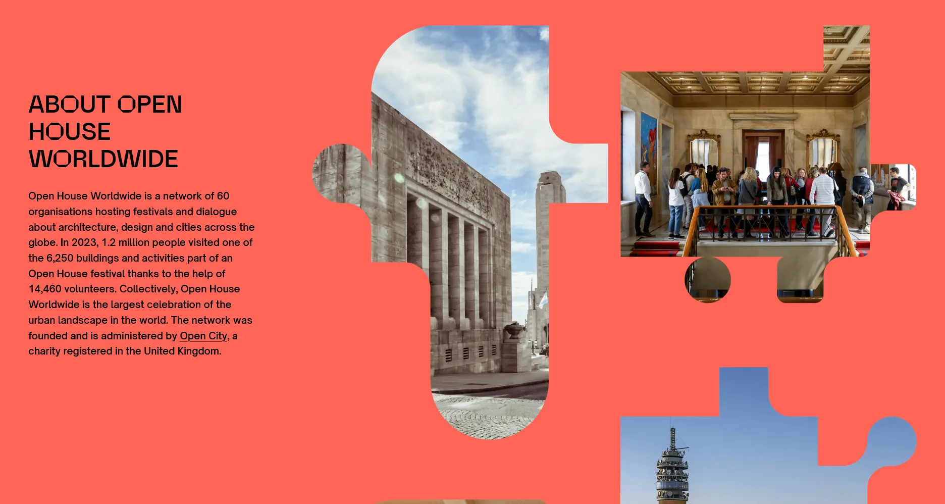
path() or shape() function.
While barely used by anyone for real clients—according to the 650+ websites I've been studying—, we can also make use of CSS gradient functions as the mask image. What's more is that we can clip an image to a text by using the background-clip property. See the code examples below.
.viewport {
    background-color: #FFF;
    overflow: clip;

    .image {
        position: relative;
        height: max(250px, 50vmin);
        width: 100%;
        background: url("...") center / cover;
        background-clip: text;
        color: transparent;
        display: grid;
        place-content: center;
        text-align: center;
        font-weight: 900;
        font-size: 5rem;
        line-height: 1;
    }
}
<div class="viewport">
    <div class="image">
        YOU'RE AWESOME
    </div>
</div>
.viewport {
    box-sizing: border-box;
    padding: 5vmin;
    background-color: #FFF;
    overflow: clip;

    .image {
        position: relative;
        height: max(250px, 50vmin);
        width: 100%;
        background: url("...") center / cover;
        mask: repeating-radial-gradient(
            circle at 0% 0%,
            black 0 1.5vmin,
            transparent1.5vmin 3vmin
        );
    }
}
<div class="viewport">
    <div class="image"></div>
</div>
Keep getting creative! Promise?